Back to the Costume: Affording Obsessions & Practicing While Waiting

All right. I’ve been waxing random for a few posts while getting some balls rolling with the costume, but there are at least a few semi-interesting tidbits to report.

Swords Into Plowshares–or at least Tablets into Sewing Machines (That’s pretty much the same thing, right?)

Fun fact: sewing machines aren’t free.

For those who missed this particular fact: What sewing I’ve done on this project up to now has been done on a borrowed sewing machine. The co-worker/friend who lent it to me is awesome (and not just because she made possible a long-term loan on a sewing machine), but the machine is one her mom uses when visiting, and the next visit is coming up in August, so it is about time to move on.

This is kind of exciting, though, because the machine is a pretty basic one, and I have been making both mental and actual lists of the features I will be excited to have on a new machine, including lots of pre-programmed stitches (including a proper stretch stitch!), multiple presser feet (including ones that make sewing slippery fabrics like spandex easier), and easier handling and monitoring of that darn bobbin (on the current machine, I know it’s about to run out at the exact moment that it runs out, which I guess means I have no idea when it’s about to run out).

The Proposed New Machine: very button-y

But the hesitation in getting a machine is–well as I said above: they cost money. So I did something I wouldn’t have imagined I would ever do just a few months ago: I sold my Android tablet for money toward a sewing machine.

It also helps that my GF has thought about getting a machine as well, so we’re going halfsies on it in the second half of this month.

I’m pretty excited. Another thing I wouldn’t have believed just a few months ago, i.e. that I could be excited about a sewing machine.

The Coming of the Costume 

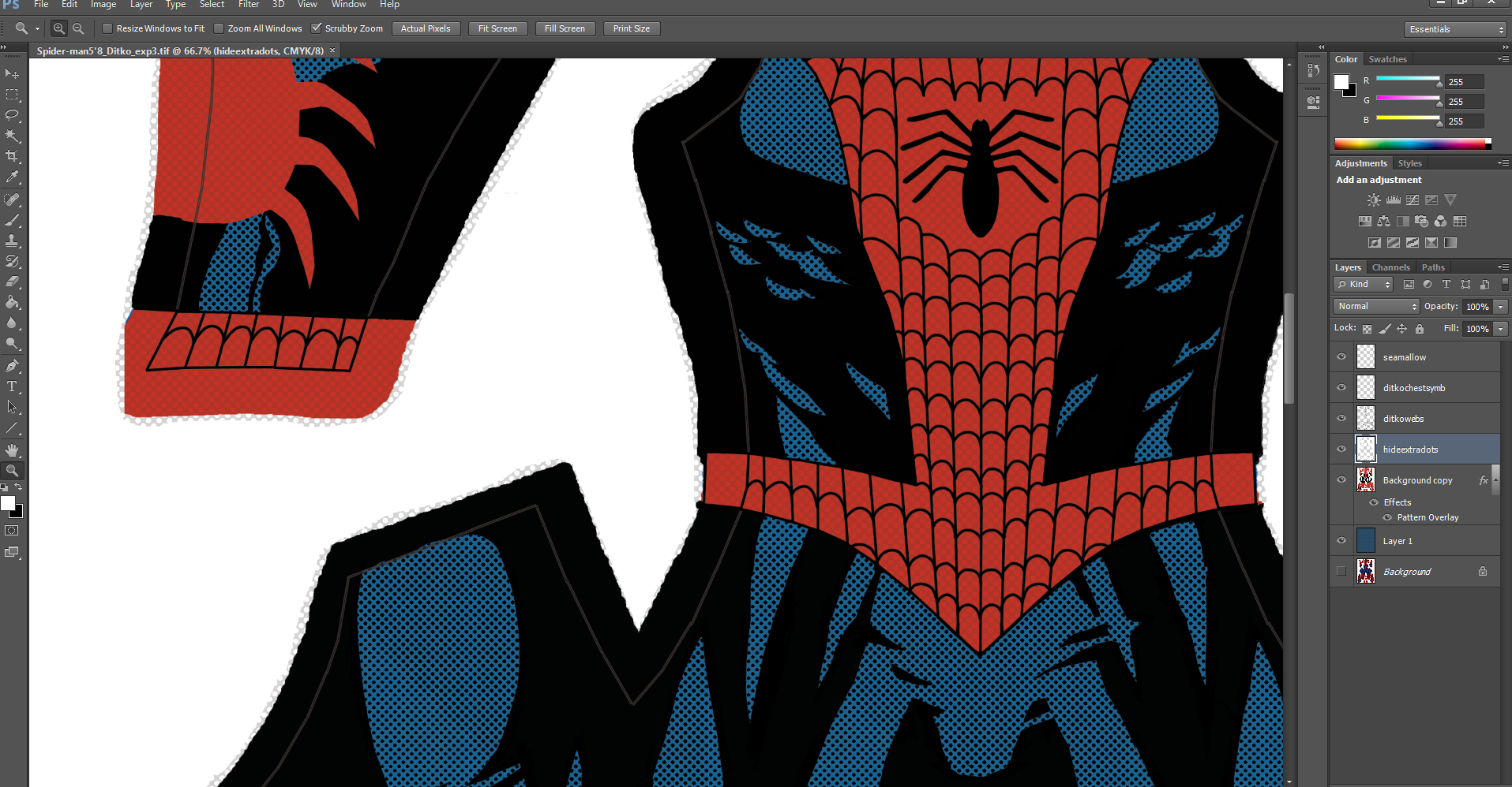
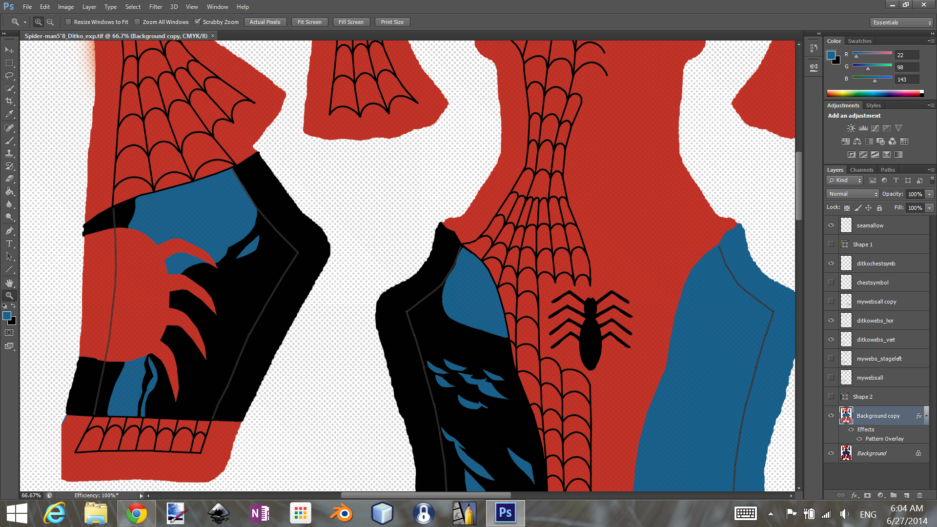
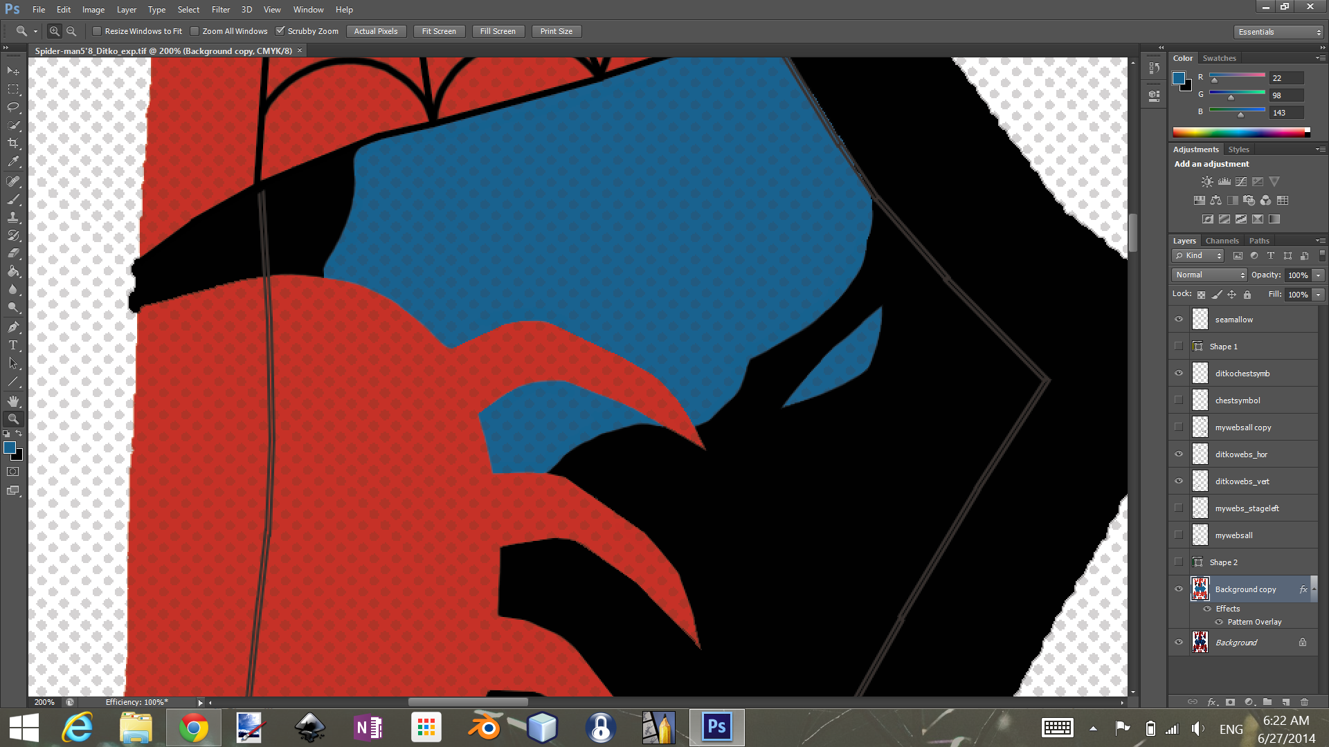
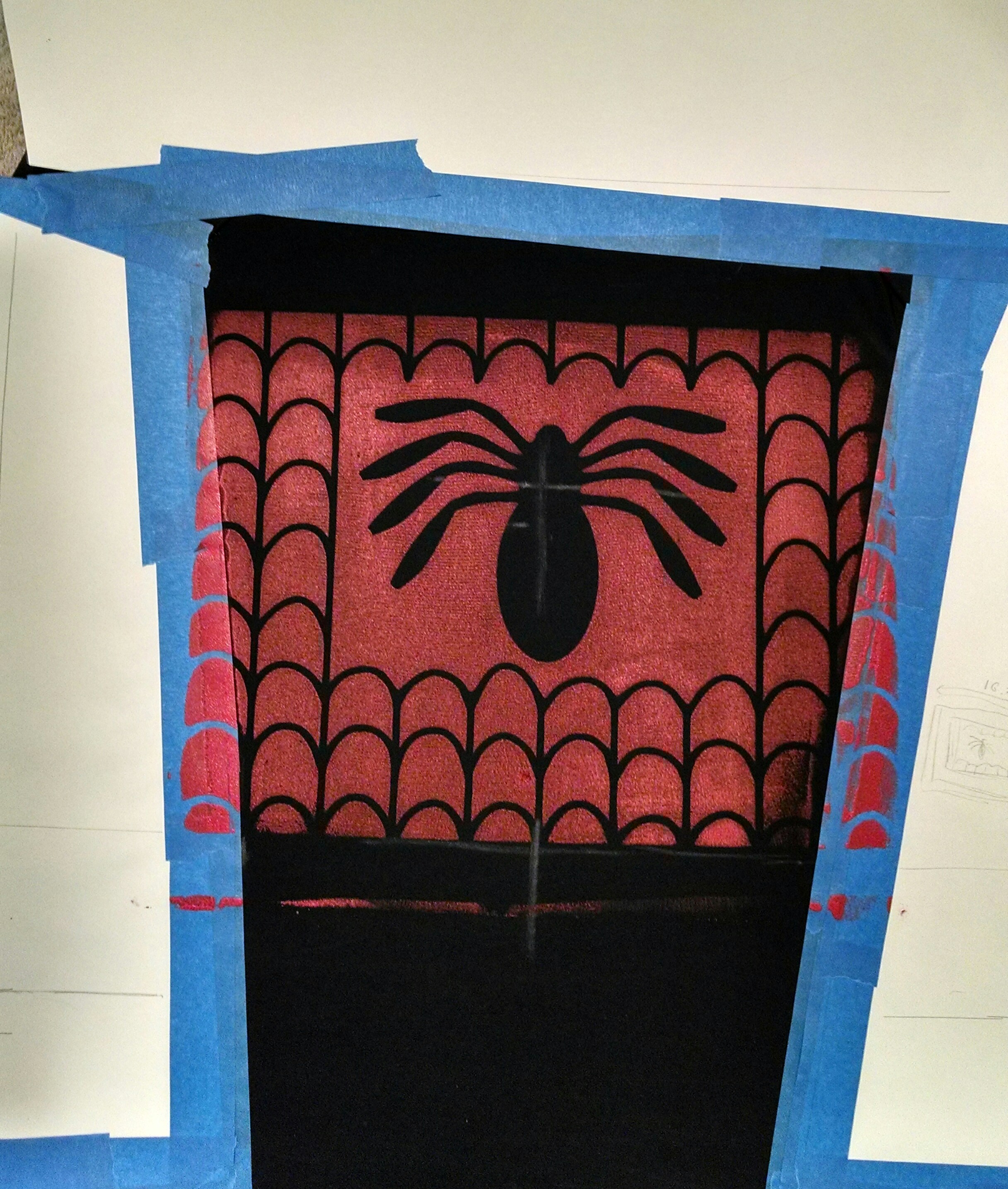
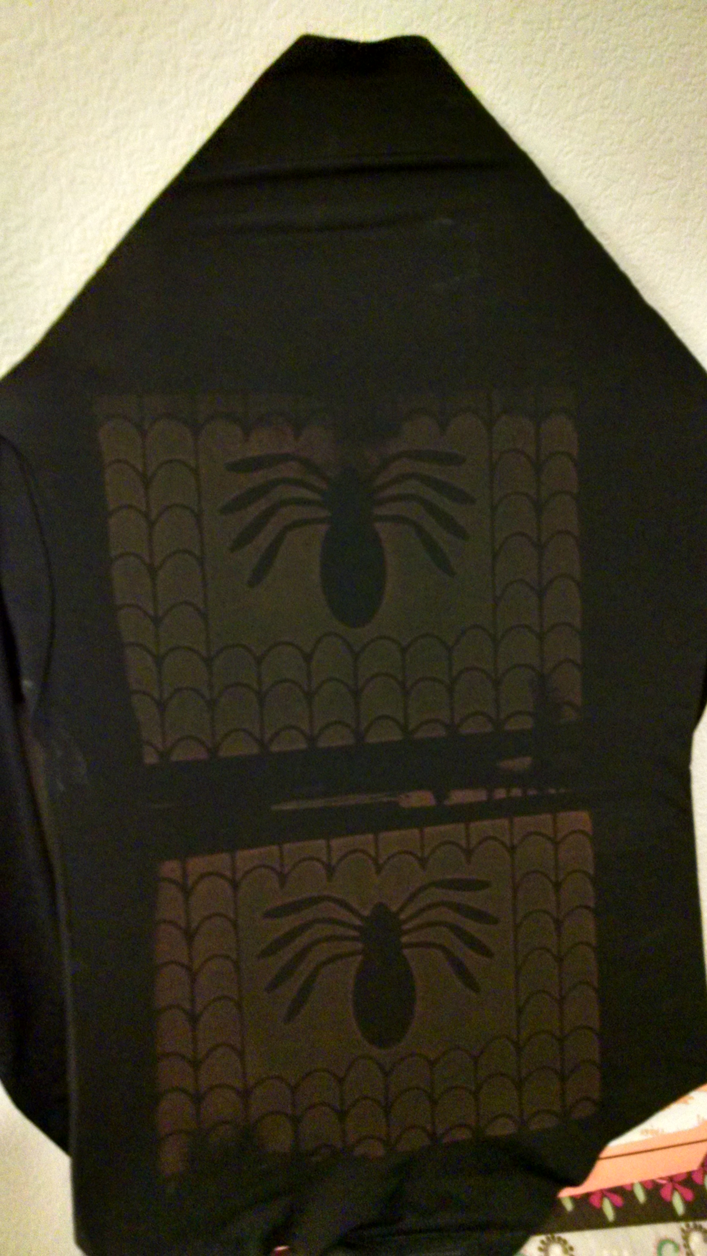
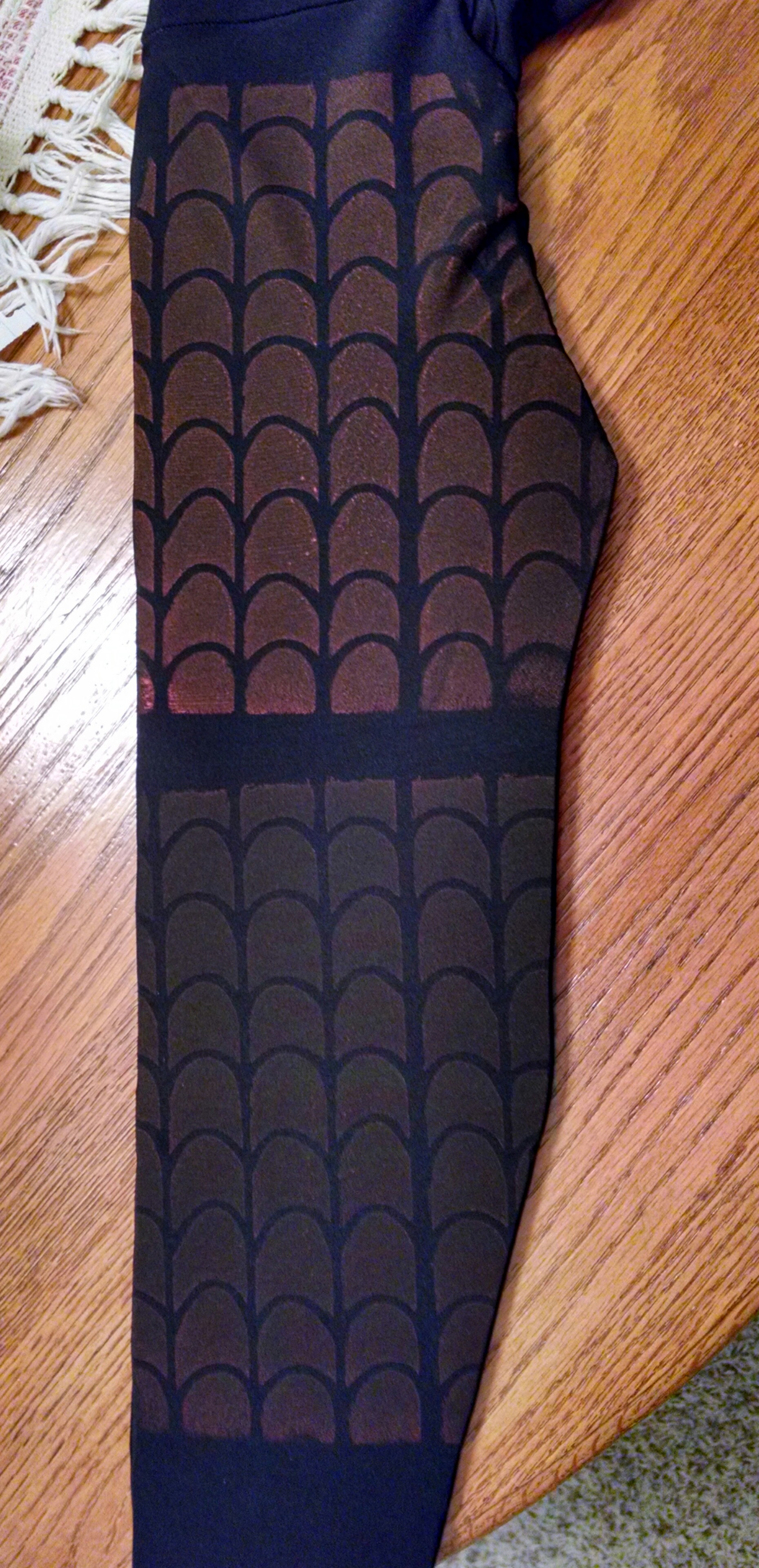
I’ve begun another step: the ordering of the Ditko Costume Design Fabric Printing.

I say “begun,” because it will take 10+ days for processing and shipping, with a few days ahead of that for me to receive and approve a printed swatch sample (which just seems like a good idea before I finalize the un-returnable purchase of the final printing!).

I decided to go with the all-in-one bodysuit style the template is designed for. Even though in comparative terms, getting the fabric professionally printed is not a bad deal, it is not an insignificant enough cost that I am willing to risk an untested sewing pattern.

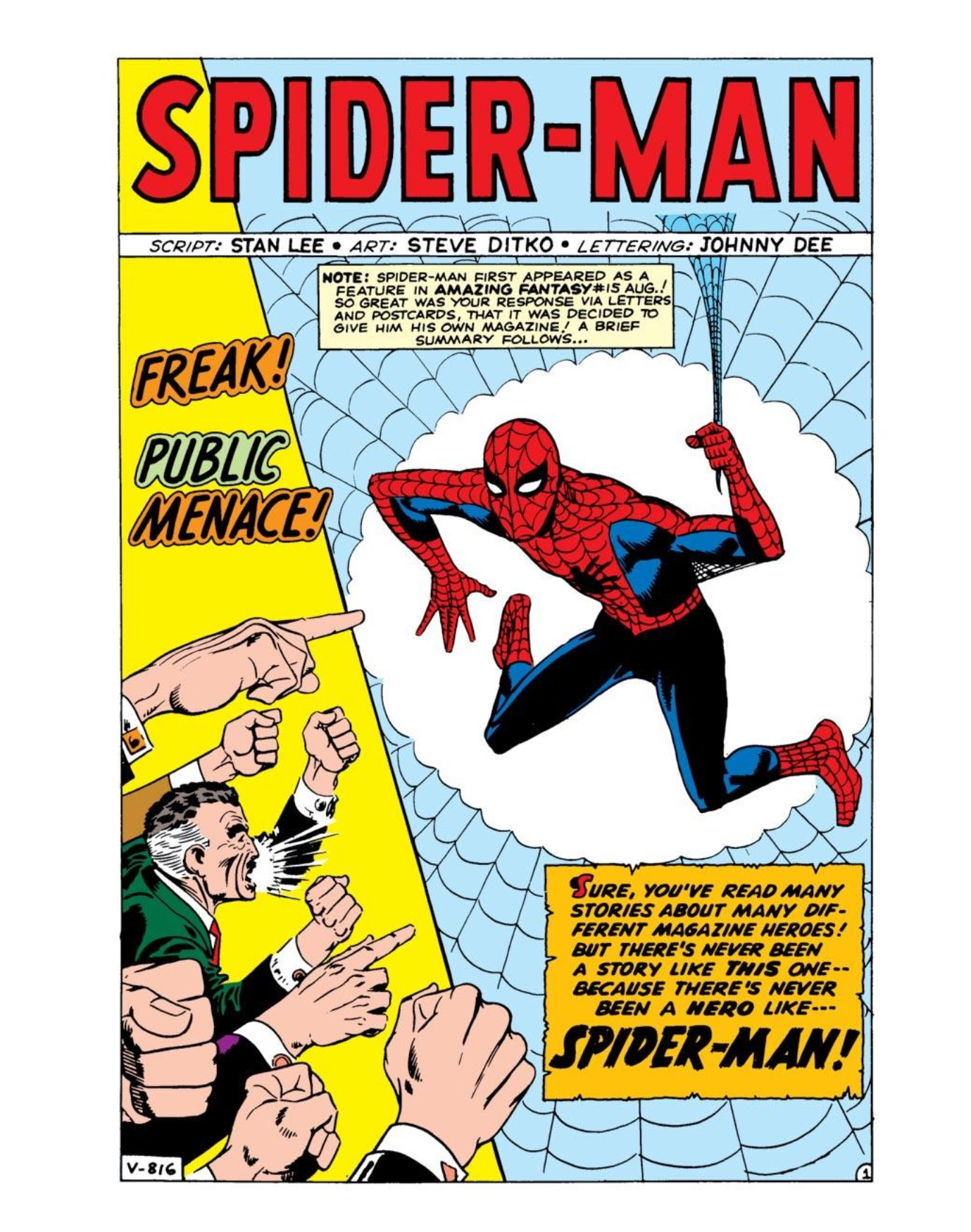
And I just couldn’t resist going with the Ditko design for the first pro printing. I am really curious to see how it turns out.

Screenshot (55)

I am still toying with other ways to do a totally DIY-at-home costume, but more on that later.

Making the Most of the Wait

So, between waiting to get the sewing machine in the second half of the month, and waiting for the completion of the ordering and processing of the pro printed fabric, I’ve got some time on my hands. But it’s a good thing. I’ve got plenty of practicing and preparation to do before I’m ready to start cutting, assembling, and sewing that pro printed fabric.

Work Space

I’ve started with readying my workspace. I rearranged my office–including swapping desks with my daughter–so that I can stop taking up the living room floor and our dining table when I’m sewing.

My daughter always liked my desk (now hers), with its shelves and drawers and cabinets, and her desk (now mine) boasts a larger, flat surface that will accommodate the sewing machine.

The office (also a guest room) has a futon that I can flatten out to get a large space for laying out and working with fabric. It’s at least a little higher than the floor.

Ideally, I need to get maybe some kind of large but lightweight piece of wood paneling to lay out so I have a flatter, firmer surface. But, baby steps.

Below is…not my work space. But isn’t it lovely? Someday…

Pictured: NOT my sewing workspace. {sigh…} Source: https://elishevashoshana.files.wordpress.com

Supplies

I could use a mannequin-head type thing for working with the mask.

Great for making Spidey masks and for doing pranks!

I’ll also need plenty of good thread in the right colors, so I don’t have to make lots of trips in the middle of the whole process of assembling and sewing.

I could use more pins/a better pin container (the pin cushion can be a bit annoying when limited to one hand I think).

Invisible zippers.

Eventually: I need to choose some materials for making the eye frames/lenses and soles for the “boots.”

Practice

I could use as much general practice as possible on less risky/cheaper stuff before digging into the pro-printed fabric, but I really need to put in some time sewing invisible zippers. Especially considering I’ve only ever sewn one zipper ever, and it wasn’t an invisible zipper. But it turned out okay, actually. And I didn’t even use a zipper foot.

Zipper? I don’t see any zipper here… Source: http://media.coletterie.com

It would also be nice to do some of that practice on the new machine. It looks like it will arrive a good week or more ahead of the pro printed fabric, the way things are going, so that should give me a chance to familiarize myself with the new machine.

And I should think it will be easier rather than harder to use. As grateful as I am to have had the loaner, it is very basic, with few bells and whistles, so I should think I’ll be delighted with the new one. But then, there’s always that “Ugh. This is different.” factor.

So…as much Patience as Progress at the moment, but hey, Onward & Upward, as they say. (Someone says that, right?)

Up Next: Practice Project Progress


Screen Printing “meh-ness” and Budget Delays

So, yesterday went by in a blur, in good and not-so-good ways, but overall a good day.

Non-Costume Stuff

We designed our shirts and exposed the designs on a screen:

wpid-img_20140628_095004676_hdr.jpg

I think whose is whose (is that grammar?) is pretty obvious. 🙂

I had actually intended to (A) make my Spider-face a negative of what’s shown above and (B) do solid fills for the letters and sun in my daughter’s design, as I always worry about the thin lines. And sure enough, that did come back to bite me later.

But first I had to rinse the exposed screens to clear out the exposed portions, and that meant leaving the screen to dry while we did other things.

We went to see Maleficent, which I enjoyed. I had heard such bad things about it, but I found it entertaining. As is often the case with movies, I could certainly see what there was to criticize, and what might have been done better, but I didn’t let that stop me from being entertained. I think too many people ruin movies for themselves by watching movies as if they are movie critics. Not that there aren’t movies that are so bad I can’t get past the “criticizeable” portions, but generally I try to allow myself to enjoy movies first, and critique them later.

After the movie, we were on our way to a late lunch when my daughter’s mom called, needing a ride to go and pick up her car. That put us a bit out of our way, distance and hunger-wise, but that just helped us enjoy our lunch all the more. We stopped at the store to get a few essentials and some T-shirts for screen printing, and it was pretty much early evening by the time we got home (or late afternoon, depending on how you look at it, I guess…).

My daughter went off to read while I got the shirts ready to print. I started with mine, and that turned into an “aargh” moment pretty quickly:

wpid-img_20140628_180800.jpg

Now, I don’t mind the “faded” look, but this was a bit too much.

Oh well. I actually ended up getting a two-pack of white T-shirts for a good price, and I can still use this as an undershirt. I figured I would try again on the other one after doing my daughter’s print.

Now, this is actually STAGE 1 of my daughter’s, as she wants two colors, and the second attempt at my print:

wpid-img_20140628_180822.jpg

Hers came out a bit light, but better than mine. Today, I’ll add the heart and the sun in red ink (to hers, not mine).

My second came out better in some ways, worse in others. I wonder if I brush on a light, faded bit of red over the webby parts? Either way… Did I mention I needed undershirts anyway?

Costume Stuff

Here’s a bit more of what the “finished” black-blue, comic-highlighted stuff on the Ditko costume:

Screenshot (54)

I go back and forth between loving and hating it. I feel like this quickly became a “slippery slope” situation in terms of the amount of muscleitude. I have another look to try, related but more understated. This…well, I like it better than all the “airbrush” type shading, but…I dunno…

Either way, I have time to keep working on and refining designs, and to decide which one–Ditko or traditional–to get printed first. I’m going to need to wait on sending either off for printing for “cash flow” reasons.

I seem to remember my mom often characterizing rocky family finance periods as “cash flow problems.” This usually happened at Christmas time, when she lost all sense of logic and proportion. Well, that hasn’t changed. Now she just spends the money on her grand-kids instead of her kids.

Up Next: Father-Daughter Screen Printing Part 2 and perhaps some Marvel Memorabilia 

Family Time & the Importance of Frenz

Family Time

It’s Saturday, and promising to be a bit gloomy and thunderstorm-y, so my daughter and I have some indoor type activities in mind.

I’ve prepared my 16×20 screen printing frame with a fresh screen and a nice coat of photo emulsion (I’m getting better at that with each attempt). I think if she and I each do a design on an 8.5×11 sheet of paper, I can fit both on the screen for exposure and get two separate T-shirts out of it. So that’ll be fun.

She also wants me to go see “Maleficent” with her. She saw it with her mom and wants to see it again with me. I have to say that seeing movies with my daughter is something I’ve been looking forward to since she was born, most especially being able to range beyond the super-young-kid types of movies (though I enjoy plenty of those too). 🙂

She is also suddenly wanting to watch more of the  “Legend of Korra” cartoon, which we haven’t watched in a while. For those who don’t know of it…it’s pretty awesome. It’s Nickelodeon’s follow up series to “Avatar: the Last Airbender,” which was just an amazing, awesome, great, wonderful, well-done, touching, engaging… Well, you get the idea. Good stuff. LofK is almost as good. Better in some ways–I feel the art is a tad more sharp and finished–but nothing matches the original AtheLA. Anyway, I highly recommend.

There are also hopes for some bike riding lessons and practice for my little girl. She has had a love-hate relationship with bike riding over the past few years, but she has an upcoming trip with her grandparents that will involve a scenic bike ride, so the pressure’s on. Just hope the weather allows for some practice this weekend.

The Importance of Frenz

Sure, “friends” are important, but I’m talking about Ron Frenz, a comic artist who I want to call underrated, just because I don’t feel like you hear much about him compared to others. But maybe he’s rated highly in the community and I just don’t know it. I, for one, had forgotten about him. But he drew, among other things, some of the Spider-Man comics I remember the most from the 80’s.

Here’s an excellent example, and what I think is a great cover:

I didn’t notice that this was in Russian (?) until after linking the image, but we’ll leave it. The art is what I’m focused on here.

This is issue number 258 of the Amazing Spider-Man from 1984. After enjoying the cool features of the black and white costume that he had acquired (on an alien world during the “Secret Wars” series of comics, one of the awesomest anythings ever), Peter discovers that the reason the suit can change it’s shape and appearance and generate its own webbing is not because its highly advanced alien technology, but because it is a sentient, symbiotic organism that has been trying to permanently bond with him. He is not okay with that.

Anyway, I think this cover is a great symbolic representation of what became an ongoing (and probably overdone) struggle between Peter and the suit in its various forms and incarnations (Venom, Carnage, ad nauseum). This was when the symbiote saga was still fresh. But I’ll speak of that no more at this time.

What I really wanted to get at here is Frenz’s take on Spidey. I have judged many an artist by their take on Spidey, and I always liked Frenz’s approach. But now, looking at him in the context of my recent Ditko craze, I see that Frenz is–intentionally or not–channeling Ditko.

Look at that web pattern, the eye size and shape, the heavy black shading of the blue areas. And pit webs! There’s a lot that’s different about the two artists, but I feel like Frenz was definitely drawing from (heh. “drawing” from…) Ditko’s original look for Spidey.

And he was also the one to draw the “bag-man” scene:

Awesome.

As for my costume efforts…

Still trucking along with the Ditko design, but the changes are incremental enough to not be worth showing yet.

But I do hope to send my “traditional” Spidey template off for printing soon. Gotta make sure all the stars are in alignment. Y’know, financially speaking and all.

Next: Hopefully will have some Family Time T-shirts to show!

Ditko Costume Design Progress

First, let me share something that was bothering me recently.

Is a hamburger a sandwich? I mean, my heart says no, but my brain says yes. I mean, you can’t say that the fact that it’s on a bun makes it not a sandwich. Put chicken on a bun, and it’s a chicken sandwich. Isn’t a burger just a ground beef sandwich? And why does “ground beef sandwich” sound gross, while “burger” sounds delicious?

Anyway… That has absolutely nothing to do with Spider-Man or Spider-Man costumes. Just needed to get that off my chest.

So, still tweaking and adjusting my Ditko costume design. I really want to make it distinct, make it reflect the early Ditko look that I am so fond of, and part of that has to do with the black-with-blue-highlights aspect. At first, I was just thinking that wouldn’t translate to 3D/real life, but then I realized that the original design style of this Gun Head Design template I’m using thumbs its nose at the 2D/3d barrier in a similar fashion. It just does so with pseudo-realistic shading and highlighting, whereas I want to do the super simplified comic book shading and highlighting.

With some guidance from the underlying Gun Head template and peering at some Spidey drawings by Ditko and others, as well as some anatomy guide images (though ultimately my design uses “comic book anatomy”), I have gotten a good start on a look that I am kind of excited about:

Screenshot (51)

I think I’m getting there. Compare to the costume’s black-blue portions on an early Ditko Spider-Man…

I also feel like this helps bring out what I’m doing with the half-tone dots pattern overlay…


Screenshot (52)

Yeah, I’m really liking this. I hope that it looks as cool “in person” (on my person, as it were) as I think it will!

I’ve only done the back and front side area so far, leaving the legs and arms. I’ll see if sparingly adding some bold black lines to parts of the red areas (i.e. “drawn” muscle lines) makes sense as well. I am also still tweaking the “webbing density” and curves.

So, yeah. Feeling good about it.

This weekend, I’m going to try and get my daughter to do a T-shirt design so we can screen print a shirt for her. I put fresh fabric on one of my frames. I was wanting to do a shirt too, but I ran out of fabric. I’ll have to wait until I can get more. Or if she isn’t interested in designing a shirt this weekend, I’ll do one instead. 🙂

Up Next: Probably Something about Spider-Man or a Spider-Man costume…

Spidey Fights Shirtless and Costume Design Update

Okay, I’m going to start by throwing things off and doing things in a different order than I put them in the title. And for me to even point that out suggests that I’m neurotic–in that I would even think about that–but not very good at being neurotic–in that I think about that but proceed with doing things out of order. But anyway…

Costume update.

To review, I have shifted focus from my totally DIY costume experiment back to finalizing my Photoshop template designs for professional printing. I have started with the “traditional” look.

Originally, I had done a design starting with a “male muscle base” pattern I got from 4 Neo Designs. I came up with a pretty satisfactory design on that “blank slate,” but when it came down to it, I got kind of paranoid about one aspect of it, that being the web pattern. I mean, you’re starting with a flat “puzzle” of pieces that will ultimately be sewn together, and being sure that the web lines line up from front to back takes some measuring, guesswork, and hoping for the best.

But getting this pattern printed on fabric isn’t exactly free, so  I ultimately decided that–for the traditional costume–I would like to at least base the webbing patterns on a tried and true foundation, and design from there. So I started with an existing “tradtional” Spider-Man costume template from GunHead Design:

Screenshot (46)

Not bad. This is the cool look for costumes nowadays, with the patterned overlay, and the shading/highlighting to suggest muscles, etc. But I want to go for a cleaner, more basic look. So I did some tweaking, keeping what I liked and adjusting the colors…

Screenshot (44)

I kept the web pattern layout to soothe my line-matching fears, but did a bolder/higher contrast webbing version on a clean, un-shaded, more muted color palette. I did a slightly “calmer” version of the chest spider based on Gun Head’s version. Redrew the seam allowances on the blue areas. Redrew the rear spider emblem based on Gun Head’s design (kudos for doing a Spider-Man costume with the traditional comic style back symbol!).

I debated about adding a pattern overlay, but ended up doing so. I can see why the movie costumes incorporate such a thing. It adds a nice, textured feel:

Screenshot (48)

I tried to keep mine small and subtle. My hope is that it will give that nice effect from a distance, but you won’t know it’s there without moving in close.

This pattern was one of a package of several free Photoshop patterns (.pat files) here: http://www.shapes4free.com/vector-photoshop-patterns/hexagon-photoshop-patterns/

Of course, I also think it’s possible that the very existence of Photoshop is to blame for these textures/patterns showing up on movie costumes. Once you get in there and start messing around in Photoshop, it’s just so easy and fun to play with all the settings. For example, to give the illusion of “raised” webbing like in the movies, I just select my webbing layer and click a few buttons:

Screenshot (49)

I don’t even like the raised webbing look, but at the same time, I’m like “Cool! Raised webbing!” I am pretty sure that the only way the first Raimi movie Spider-Man ended up with raised webs is from the costume designers playing around in Photoshop.

I am not going to do raised webs for this version.

So, up next, the part that I am really looking forward to: I am going to start from this design/template and do some major modifications to achieve the Ditko-style costume with separate mask, gloves, boots, shirt, and pants.

This means I will be getting a bit more adventurous with the webbing pattern, as well as the front and rear spider symbols, the colors, the eyes, and even the red/blue area layout.

And I will be getting very adventurous with the template in terms of the ultimate sewing pattern. That should be interesting.

And now, as promised, Spider-Man fights shirtless.

So, the context: he was surprising a room full of gun-toting baddies led by the Kingpin (the big bald guy in the pics, for those who don’t know). He wanted to start with a distraction, so employed a tactic he used a time or two back in the day, i.e. making a decoy, in this case using his webbing dressed in his costume shirt.

Yes, just the shirt. It makes just as much sense as it sounds. But, y’know, it was partly dark and stuff, and the decoy was in motion as it swung down on webbing…

Anyway, moving on. The dubiousness of the tactic is immaterial, as it was worth it, resulting as it did in great out of context pics like this:

Screenshot_2014-06-18-18-03-24

If you didn’t know better, you would think someone had gone in and digitally edited this for fun.

And the best part is how–a page or two later–he takes the time to put his shirt back on while the Kingpin is taking swings at him.

Screenshot_2014-06-18-18-04-05

Love these old stories. You just don’t see stuff like that much anymore.

Up Soon: The Beginnings of Attempt #2 of the Ditko costume, and soon-to-come bodysuit sewing adventures.

How Could Peter Do It?

That title sounds more accusatory than I intended…

What I mean is, now that I am at this somewhat flummoxed stage of my DIY Spidey costume, I am at a point where I am asking, “No, seriously…how did this 16 year old kid with very little money seamlessly silkscreen (I’ll give him the sewing part) a bodysuit with such a complex and particular pattern?”

I thought I’d do a little mental simulating of what it would take to do so, based on my experience with attempting to do so.

I am going to assume that with the way the web pattern is represented in the comics–i.e. all connecting nicely from top to bottom, mask to torso to gloves, front to back–that he would have almost had to do one big screen to apply the ink all at once. We can allow that the boots could be done separately, since they don’t have to integrate with the torso pattern. But I am going to hold to the need for the entire torso–including mask and gloves–to integrate smoothly, thus be all printed by one screen.

How big would that screen have to be? Well, I suppose you would need to figure that he would be silkscreening the red portion of the fabric for the torso pre-sewing, and that would include the vertical length from the top of the mask to the bottom of the belt, doubled (front and back, remember?). Based on Peter’s height (5’10”, if memory serves) that would be roughly 60+ inches long, if you figure 30 something inches from head top to waist area depending on his proportions (I’m using myself as a rough guide).

The width is a little tricky. The length from one’s fingertips to fingertips, arms fully outstretched horizontally, roughly equals the height. That would put the screen at 5’10”. But a shirt typically has the arms angling down somewhat, as sewn. Would that cut the height a few inches? Probably.

Still, we’re looking at a screen that is roughly 60+ inches by 60+ inches. To use that kind of screen for the DIY type of screen printing I’ve been working with, you would be talking about laying that screen on the fabric securely and dragging a squeegee across the whole thing to apply the ink. Doesn’t seem very practical. Even assuming that Peter was hiding this massive screen in the attic or something (and hosing it off outside in the middle of the night to clean it?), it raises too many questions to even begin to answer.

Really, at that size, you would be talking about some kind of professional screen printing press. So I am going to assume that he “knew a guy” or something. Someone who ran or worked at a screen printing factory and would do this for him on the sly and on the cheap. And Peter would have had to either set this up anonymously, somehow, or maybe tell the guy something similar to what he led people to believe about his Spidey photos for the bugle, that he and Spider-Man had an arrangement of some kind.

All of this seems to lead to a disturbing conclusion: The chances of a teenager (with the proportional strength, speed, and agility of a spider (gained from being bitten by a radioactive spider) who fights crime to avenge the death of his father-like Uncle that said teen could have prevented had he not been so self-absorbed) making his own spandex costume so expertly with the resources available to him are pretty slim.

Hmph. Imagine that.


The Gambler versus the Parent

The Gambler

Let me start with a story from when I was in grade school. I was probably in 1st grade, possibly 2nd, and I had just started learning to ride a bike without training wheels. My family lived in the housing of a private college campus, a relatively small and self-contained place, objectively, but to us “campus kids,” it was a pretty big place, full of adventure.

There are plenty of other stories to tell about that campus kid life, but this one is about the Time I was Hit by a Car Driven by Kenny Rogers.*

* Spoiler Alert: Not really Kenny Rogers

Kenny

He didn’t look like this then, but this pic was too awesome not to post.

I was riding my bike among the buildings in an older part of campus, and took a corner around a particular building, headed the wrong way down a one way street. Turns out a car was headed the right way around the corner at the same time.

Again, I was just learning to ride–and have never been known for things like coordination and reflexes. I don’t know how much time there was to hit the brakes or swerve, but my inexperienced, 1st grade body did the best thing it could come up with and just slammed right into the front bumper of the car. I think I might have actually pitched forward onto the hood a bit, but memory does tend to dramatize these things.

Anyway, the driver did have reflexes, luckily, and had braked somewhat. He probably hadn’t been going that fast anyway. I was fine, just shaken up. Especially when I looked up at that driver as he got out of the car and it was Kenny Rogers.

Okay, okay. It wasn’t really Kenny Rogers. But my first grade self was at least half-convinced it was, even after my dad assured me it was just some older student of the college (there were a fair number of older married students there).

Strangely, everyone else seemed more focused on the fact that I had gotten sorta kinda hit by a car than that this was clearly Kenny Rogers. And since I was fine, a lot of the focus of this scenario was the fact that I had been going the wrong way down a one way street and that was dangerous and so on and so forth.

This experience would serve as a valuable lesson in safety and awareness that would one day lead to me wrecking three cars in the five years after I started driving.

In any case, my point is this: That guy who hit me on my bike looked just like Kenny Rogers (a small part of my brain still thinks maybe Kenny lived a secret part of his life there at that college campus with that family…). And Kenny Rogers sang the song The Gambler. And The Gambler has an important lesson:

You gotta know when to hold ’em,
Know when to fold ’em,
Know when to walk away,
Know when to run.

The Parent

The lesson from the Gambler doesn’t apply to parenting, generally speaking. I mean, I’m sure you could come up with a scenario, or a way of looking at it, in which it does apply. But that would ruin my cleanly dichotomous contrast here, so just work with me, okay?

I have a 9 year old girl. She’s not–whatever I might often say–perfect. She doesn’t always clean her room (as in, never unless I make her). She doesn’t always remember to turn in her homework. (Though she pretty much always remembers to do it and does a very good job of it because she’s a freakin’ genius. She’s not perfect, but she is a genius, all right?)

Anyway, our children are not perfect, but we don’t just one day up and “fold ’em” and “walk away” (though yes, there are days we want to “run”).

Again, we could take this whole comparison farther, and talk about how much of the parenting experience comes from “the hand that we are dealt” and how much of it is a result of our own example and decisions as a parent, which cards we choose to trade in for other cards and yada yada…

But really, it’s not some formula or set of rules or whatever. We stick to it because we are wonderfully irrational about our children. Love is like that. Especially parental love. When it comes to our children, we’ll keep putting all our money back in the pot based on a pair of two’s because, I mean, gosh, that’s my little girl, and I’d bet on her every time.

Wait, isn’t this blog something to do with a DIY Spider-Man Costume?

Oh yeah. This was supposed to be about my DIY Spider-Man costume.

I was originally intending to make some comparison and analogy and somethin’ somethin’ about two ways of going forward with my costume, and got carried away.

I am at a point of decision here, having started the official screen printing on the official costume shirt:

Eh...not perfect, but okay so far...

Eh…not perfect, but okay so far…

Ouch... Hope that dries to match...and can that be touched up...?

Ouch… Hope that dries to match…and can that be touched up…?

Oh. Uh. I...yikes.

Oh. Uh. I…yikes.

Here’s where I think the analogy comes in, the competing perspectives. I go back and forth between looking at the costume as the Parent and looking at it as The Gambler.

As the Parent, I overlook the rough edges–and I mean that literally, not figuratively–and the glaring spots of mismatched color, the not quite matched up web pattern (though I came closer to matching that up than I thought possible!)…

As the Gambler, I do notice those flaws, and also think about how those will continue, and magnify, and how the odds are that I will invest x number of hours (in addition to what I have invested already) and x number of dollars (in addition to what I have invested already) only to fight a losing battle. The odds of getting not just a particular screen print pattern correctly applied are slim enough, but to get each applied correctly and matching the other ones…

Know when to fold ’em, right?

But…but it could still work. I mean, it’s not perfect, but it’s kind of cool, right?

Know when to walk away.

(Am I being too dramatic? I’m being too dramatic.)

So…now what?

I mentioned that I’m stubborn. But I’m not a perfectionist. That’s my saving grace here. If I were truly a perfectionist, I suppose I would keep doing this over and over until I get it right.

But considering I’m not even sure it[‘s possible to do this process perfectly (in the context of a reasonable amount of time and money, at least), then thank god for not being a perfectionist about this. Though taking it to that extreme would probably count as having Obsessive Compulsive Disorder or something…

I’m not giving up on the overall goal of a costume. Again, the original goal here was to design a template to be professionally screen printed and then sew that fabric together myself. That remains the ultimate goal.

As for the test costume, the one meant to somewhat emulate the Peter Parker homemade type style… I’m not sure yet whether I’m going to be abandoning that entirely. But I definitely need to stop and reevaluate.

What I’m doing with the screen printing isn’t working. I’ve been suspecting that for a while now, but that became more certain after the recent work. The shirt alone would require four more distinct screens–representing days of prep–and fourteen more printings of four coats each (many hours of work spread over days) just to get that still-not-so-bright red that doesn’t quite apply evenly and ends up with splotchy edges…

Even doing a new shirt with two fabric colors–along with new mask, boots, and gloves–would take care of the red part, but wouldn’t change the total number and dimensions of the screens, the issues with matching the web patterns across multiple printings…

Aargh.

So…again…now what? This post is getting pretty long y’know…

I think that, for now, I will re-focus on designing the template for the professionally screen-printed costume that I will sew together.

I think that one will be a more traditional/recognizable Spider-Man costume, since it will likely be worn for some public library events where the general public would not really appreciate the subtle geekery of a Ditko style costume….

I will reevaluate the Peter Parker DIY style/Ditko style costume. I am still interested in doing one in the “separate mask, gloves, boots, shirt, pants” style. But I think I will need to have the fabric professionally screen printed. I think I could modify the “full bodysuit” style template to one that will meet the Peter Parker DIY style needs.

So, what have we gained here?

I have certainly learned that ol’ Petey would have had a really hard time putting that costume together back in the day.

I have also learned that screen printing–while very difficult for a full body costume–is wicked fun for making t-shirts. I am going to fit some new fabric on a screen and have my daughter design a T-shirt for herself that I will screen print. And I think I will, at some point, make a T-shirt using my Spider-Man mask design. Black or red lines on a blue shirt, I think…

No need for all these screen printing supplies to go to waste, right?

mask_topAndBottomPreview

Just about ready to go for it…

So, there comes a time when careful planning and preparation must give way to action. Whether it be in matters of love or war or–well–Spider-Man costume making.

I got some pointers about ink on dark fabric from an artist who has done some screen printing. I had wondered whether doing multiple coats was an option, and this artist verified that yes, there is a precedent for that. You just have to “register” the screen with the fabric, which basically means clamping the two together so that the coats get  laid down in the exact same place. That way you can lay down a coat of ink, let that dry a bit, and then lay down another one, etc.

I did some experimenting along these lines by laying another coat over the existing test prints on my test shirt. These coats are not lined up, as they are done at completely separate times without “registering,” but they illustrate how much difference a second coat makes:

wpid-wp-1403291336728.jpeg

You can compare the overlapped portions in the middle with the non-overlapped (underlapped? No,that doesn’t make sense…) around the sides. On the bottom, I had even played around with adding ink and doing another swipe immediately after the first, but that made a negligible difference and also seemed to create more unevenness of coverage.

Anyway, that’s encouraging. I think three–maybe four–coats will do it. I will add another layer to this test later on to see if three will do. I’d like to avoid getting a layer of ink so thick that it will restrict stretch and be prone to cracking.

I’m okay with the red having sort of a cool blackish and gritty look as long as it is clearly contrasted from the unprinted black fabric.

I also successfully completed attempt #3 for the wide webbing pattern that will end up as the base of the torso front and back. I was *very* happy with the job I did applying the emulsion this time, and think I will do even better on the upcoming screens.

wpid-img_20140620_143312.jpg

And, while I do feel like I’m on the verge of really starting to screen print the actual costume, there is one rather important aspect to figure out, and that is how to precisely line up the separate sections of printing on the costume*. This will matter most for printing the shirt, especially the connection between the chest emblem pattern and the way its web pattern “frame” interacts with the patterns below and above it.

But if I can figure that out tonight and tomorrow, then I would love to go and get some ink laid down on the costume shirt. And I suppose I just have to be ready to sew a new shirt if it comes down to it!  :/

*Update: Ha. Once I started mocking it up in Inkscape with shapes and layers and such, I realized it was actually simple. Well, in concept, at least.

The horizontal positioning was easy enough anyway; I just make guide lines on either side of the frame to make sure that the second print matches the first one horizontally.

For the vertical, though, all I have to do is carefully measure the height of the first print and position the first frame that amount below the first, and that will line up the top of the second print with the bottom of the first. That’s for lining up the torso base web pattern with the chest emblem pattern.

For the left and right shoulder web patterns, above the chest emblem, they will be offset horizontally by half the width of the chest emblem pattern. Still, simple concept.

I’m sure someone who’s good at math and such could have figured this out in his or her head, without the need to visualize it, but hey, I’m a picture kind of guy.

Stubbornness as a Foundational Personality Trait

Just as I am not patient, neither am I a perfectionist. Seriously, I’m not. In the same way that I can use stubbornness as a substitute for patience, I can use it as a stand-in for perfectionism.

I’m beginning to wonder if my entire personality is comprised of different variations of stubbornness.

Yesterday, I had decided that my redone 16×20 screen was usable. Passable. I was on the verge of deciding to re-redo it more than once, but kept saying “no, it’s fine.”

It’s that “fine” part that finally got me. “Fine?” That means I’m settling.

It’s not just stubbornness or pseudo-perfectionism or whatever. There are reasons it wasn’t a usable screen. Details that would bug me later. (I guess that’s probably the same kind of thing that perfectionists say…) So I decided last night to re-do it.

Cleaning that screen fabric again would have been pretty iffy. The emulsion was pretty well settled in. Any method to take off the emulsion was pretty likely to ruin the fabric, and since I had gotten a bunch of extra fabric anyway, I decided to do another new part of the screen printing process: I changed out the fabric in the 16×20 screen.

Turns out it was much easier than cleaning it. I didn’t take pictures, because it wasn’t that visually interesting. But I was surprised at how this type of screen is put together. If you are interested, check out this great little video I watched:

So, each step of screen printing seems to usually involve cleaning of some kind. (Why ruin a perfectly good artistic activity with cleaning?) After getting fresh fabric on the frame, I had to give it a gentle cleaning, and leave it to dry overnight since I did it so late.

Now, once I get a bit more coffee in me, I will apply emulsion again. And hopefully I will be a bit better at it this time, and less apprehensive. And then wait for it to dry.

In the time between steps, I have been working on a big picture design model for how this will all come together (hopefully):

Screenshot (43)

Here is a screenshot of a layout of the upper torso. A unique screen for the chest emblem, another unique screen for one side of the neck and shoulder. (That screen will work for one side of the front and one side of the back; a separate screen will be needed for the other sides of the front and back, since you can’t flip a screen frame for applying ink.)

The single generic web pattern screen will cover the fronts and backs of the arms via repeated ink applications, and should also work for the forearms of the gloves. Possibly the boots. I will have to see if that will translate the way I want it to.

Of course, I still have to figure out what to do about this rather important issue:

wpid-img_20140620_053906262_hdr.jpg

These are some more test prints I did on the first spandex shirt I sewed. See how the red is not exactly vibrant? Heck, it hardly even qualifies as “visible.” It actually shows up better in the picture than in real life. Part of it might be my technique (which I am obviously still working on), but as I mentioned yesterday, there is another kind of ink I can try that is designed for dark fabrics.

There are also some specialized inks called “plastisols” that are supposed to be ideal for opaque coverage of stretch fabrics, but they seem to be designed for professional, industrial screen printing methods and I don’t think they will serve here.

Another possibility is to re-sew an entire new costume out of blue fabric, which might show the red better (if it doesn’t just make it come out looking purple). Or, on that same vein, I could sew a new shirt using red and black fabric, and sew a new mask, gloves, and boots using that red as well. Then I could screen print black web patterns onto the red, which would show up much more easily. That would certainly be a whole new sewing adventure, reworking the pattern to smoothly sew together the two fabrics for the shirt.

But at that point, would it make sense for me to go ahead and move on to the originally planned “real” costume, sewn from the professionally screen printed pattern? Probably. But then, would I be doing any of this if it made any sense?

Stay tuned. That is, if you’re as curious to find out what I’ll do next as I am.


Channeling Bob Wiley

“…baby steps get on the bus, baby steps down the aisle, baby steps…” –Bob Wiley, “What About Bob”

I like to think I’m a patient person. I mean, I like to think that, even if I know it’s not true. But I am a stubborn person, and I like to think that can substitute for patience in the right situations. I am doing my best to apply it in this whole screen printing adventure. Not only is it tricky to get things just right sometimes, not only is it messy, but you have to wait hours in between steps before determining if the last step was even successful!

So, anyway… The good news is that despite fears that I had botched my 16×20 screen prep again, it has turned out to be a salvageable effort. I think.

wpid-img_20140618_181420979_hdr.jpg

I definitely still need to work on my technique for applying photo emulsion, and I have checked out some videos to get what I think will be helpful tips. But this time the part that I messed up was the exposure process, which is supposed to be the easy part!

But I did a little test, and I think that the only real issues having to do with the screen itself–some rough edges and empty spots–can be touched up with screen filler. So that’s good.

wpid-wp-1403180076007.jpeg

Here are the two tests I did on my test spandex shirt sleeve. The first try–to the left–obviously needed more ink. The second try is still not covering the black too great. It might take more ink, or it might take a different kind of ink. This is just the fabric ink that came with the kit, but there are more opaque types designed for dark backgrounds, so I will give that a try as well. (I also need a good method to line up one print with the next. I have a theory, just need to try it out.)

I also want to try my first screen–the one with the chest emblem–on the spandex, just to be sure that the issue is the fabric/ink and not something about my second screen. But I am pretty sure it’s the fabric/ink.

Either way, I am definitely having to settle in for the long haul here. Like I said above, even when things go well with each step, there are several hours between each step, which in the context of sleep and a job means I’m usually lucky to get 2 steps done on a typical weekday!

But hey, maybe this will all help my stubbornness turn into actual patience!