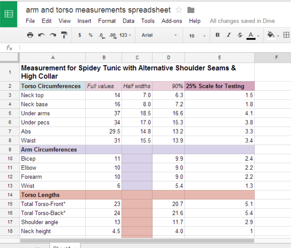
Yep–gonna have to do some silkscreening…

Sigh…

Well, I did some more experimenting with fabric painting yesterday, still doing my best to avoid having to do silkscreens. But looks like there’s a good reason why silkscreens are the way people put pictures on clothes. Who’d of thought?

Here’s a visual rundown of my not so successful experiments:

Tape

Tape

wpid-img_20140607_065716.jpg

Not a horrible result, but would be almost impossible to cut out the shapes with any precision.

Frisket Film (adhesive-backed film with peel-away backing) -- seems promising

Frisket Film (adhesive-backed film with peel-away backing) — seems promising

wpid-img_20140607_125341786_hdr.jpg


Oh well...

Blurry edges from paint leaking under. Oh well…

Unless I have some amazing revelation to the contrary, I will plan on doing some silkscreens in the not-too-distant future.

Costume Work: adding the collar to the shirt

I was a good boy and didn’t completely avoid costume construction stuff.

I was really avoiding tackling the addition of the higher collar to the shirt, and as I started taking a closer look at it, I understood why. I really had no idea where to begin. I took a general look at the Interwebs, but sensed that there was not going to be a definitive step by step for this one.

So I dove in. I did use a looser stitch, so that I could undo and redo if needed, and that was a good idea.

I examined, I pieced, I pinned, I agonized, but I pushed through.

I screwed up closing the final stitches, tore them out (I can’t get my borrowed machine to putt a straight stitch into spandex to save my life, so a looser zigzag was the best I could do).

I screwed up re-doing the final stitches, tore them out again (Harder to do this time since I back-stitched over them for some reason).

Re-re-did the final stitches by hand (they’re in a hidden place, so I was ready to not care what it looked like).

And here we go:

wpid-img_20140607_145936.jpg

wpid-img_20140607_145916.jpg

wpid-img_20140607_150047.jpg

There is some definite wonkiness to the stitches, but I have to say that I am overall proud of this, especially considering that I mostly made it up as I went along.

I do wish I could’ve figured a way to extend the collar up with fewer seams. The nice thing about the first version of my shirt was the smooth high collar, with only subtle side seams. But this new one fits better, feels more stable yet more flexible, and has the extra length I need to work with at the bottom for interfacing with the pants. So I’m pretty pleased with it.

Costume Components Checklist

Pants: check
Shirt: check
Mask: check
Boots: check
Gloves: 1 out of 2

Just one more glove to sew and the pieces are done. And then:

Costume Finishing Work Checklist

Pants: hem wasit and ankles; add velcro outside front/back (to attach to shirt); possibly add velcro at calves to keep boots up
Shirt: hem wrists; trim/shape waist(to add point to bottom front); hem waist; add velcro inside front/back
Gloves: hem; possibly add zipper or velocroed opening for easier donning/tightening
Boots: hem tops; possibly add elastic or velcro
Mask: maybe hem bottom; eyeholes/lenses (a whole plan to make there)

So, it looks like all that’s what I’ll be working on next. And then I’ll start gathering knowledge and  gradually gathering supplies for screenprinting/silkscreening (including figuring which of those two somewhat different things I am technically going to be doing).

Up Next: Devilish Details or Maybe a Vaguely Related Tangent, depending on my mood

This is Only a Test

So, I stopped by the fabric store for lots of elastic and Velcro for finishing work on the pants and tunic of my in-process costume. Since the art store was right next door, I grabbed a jar of Neopaque fabric paint to do some experimenting.

I still have my very first attempt at a mask, so I figured it would be good for testing out the paint and beginning to develop some techniques, some dos and don’ts for the costume painting process.

This particular experiment was really just to see how the paint goes onto the spandex, how hard it is to get clean edges, how much is needed for coverage, how stiff or flexible it ends up, etc. But I also wanted to test the waters, see whether or not I can make this simpler and cheaper than actually using silkscreening/screenprinting techniques.

Costume Painting Experiment 1: Freehand and Crude Stencil Painting

wpid-img_20140606_175912844_hdr.jpg

Stretched it onto cardboard

Tried some freehand painting

Tried some freehand painting

Testing a very crude stencil (made from a protein bar box)

Testing a very crude stencil (made from a protein bar box)

Crude stencil = crude results

Crude stencil = crude results

Touch up with paint and Sharpie

Touch up with paint and Sharpie (bottom part only)

Conclusions: the techniques

Again, this is mainly a test of the paint on the fabric, and I did it with basic materials and didn’t spend a lot of time. I think if I created some proper boards or some such for stretching the pieces flat, and spent a whole lotta time painting and touching up after, I could probably freehand a decent job. With a good stencil technique that properly seals off the areas I don’t want painted, I think it would be a lot faster and look a lot cleaner.

Conclusions: the paint

As for the paint itself, it’s not too bad, considering. I mean, considering we’re painting onto black, porous, stretchy material.

The painted portion of the top half of the mask above is the result of really just a half-hearted effort at coverage. Maybe a coat and a half of paint? The bottom half is closer to a double coat. The material gets a smidge stiff, but not too bad, and I think that painting the red on black, resulting in the web patterns as unpainted spandex, will have the serendipitous result of retaining flexibility via the stretch between the painted sections.

Conclusions: the aesthetics

Obviously what’s pictured above is not the final look, but there seems to be an intriguing choice to make, and once that I had kind of anticipated, knowing that I was painting on black. Do I want to get full coverage with the paint, i.e. achieve the true red? I kind of like the dark grittiness of the partial coverage. Kind of goes with the black and red color scheme. I would definitely want to get cleaner edges and fairly even coverage, but I do kind of like the gritty red look.

Screenprinting pros and cons

I keep going through all these non-screenprinting ideas in my head, and then occasionally think “I should really just give in and screen print this thing.” So I go back to all the blogs and how-to sites about screenprinting that I bookmarked. And it all sounds not too bad until I get to the part that’s something like “just cut out your design and place it on the screen for exposure…” It just seems like the “reverse web pattern” would be kind of tricky for that part.

reverse_webs

It would be kind of like that, but times a thousand. I don’t know how many of the “between-the-webs” components it would take, but it would be a lot, and note that the parts to cut out for placement on the screen for exposure would be the black parts, as that would be the part of the screen you would want to leave “open” for the paint to go through. That means nth number of free-floating “curvy squares” to arrange properly. I think I could re-use some of them, but there would be a fair amount of customization needed for different parts of the costume.

Yes, this will be a complicated pattern regardless, but to add the complication of creating and exposing the screens with this pattern… I don’t know, I could be wrong, but I feel like a good but somewhat on-the-fly stenciling technique would be a more direct approach, and more to my tastes.

So…on to more experiments. But I also need to do some practice/prep for hemming and adding elastic to the costume. I am pretty sure this painting thing is my way of avoiding that.

Up Next: Hemming and Elastic–unless I do more painting experiments to keep avoiding it

Tunics & Masks & Easing Pattern Production

wpid-img_20140605_095248.jpg

Yesterday being my day of the week to work a later shift, I decided to go ahead and crank out the tunic. I think it came out pretty well. It’s definitely tight enough overall, yet the alternate sleeve seam design provides some excellent shoulder flexibility, which is good. I made the waist hem plenty long enough for the trimming, hemming, and modification that will be involved in it “interfacing” with the waist of the pants. The collar looks rough, but of course the plan here is to add an extended collar. I was actually pleasantly surprised that the collar as-is comes as high on the neck as it does.

So, as for the mask. I debated whether to make another one or not. I was pretty happy with the previous iteration, my only wish being that it was a little longer in the neck. So I made some modifications to the pattern last night after work and set to cutting fabric.

I suppose this is probably a typical sewing thing, but as soon as I had finished cutting the fabric and saw a spot where I had flubbed cutting a curve properly, I had a feeling things weren’t going to end well.

Sure enough, the final product had some lumpy seam issues, right on the top of the mask. And the longer neck…well, not sure it was really worth it, without some more intense measuring and geometry and maybe some zippers.

Here’s the old mask and the new mask together for comparison:

Old mask: me like

Old mask: me like

wpid-img_20140606_042626.jpg

New mask. turtle man?

I tried to get too fancy with the extra length, but it was just hard to account for the spreading circumference of the neck and the lay on the shoulders, and there would probably need to be a split in the spandex on each side for it to lay down on the shoulders, kind of straddle them… Add to that the “lump” on top of the head on the new one where I messed up cutting the fabric and then couldn’t sew the seams properly as a result. I was able to fiddle around later and flatten it out a tiny bit, but not enough.

So, looking at the old mask afresh, I see that the neck length is actually kind of ideal, engineering-wise, as it stops right where the neck starts widening. And it’s really not that far off in terms of closing the gap with the pre-enhanced collar of the new shirt:

wpid-img_20140606_045628.jpg

I think just 2 or 3 inches on the collar–along with some system for securing the mask–will do the trick.

Incidentally, trying on this mask makes me very aware how much I need to cut my hair and trim my beard. From certain angles, there is a visible lump formed under the mask by my hair, and  beard hairs actually poke through the spandex here and there.

Digitizing Pattern Making

I also did a bit of work on a good way to make and store patterns digitally. As promised, I gave this a try in the open source vector graphics editor, Inkscape (available for free download at http://inkscape.org/en/ ) .

For my experiment, I duplicated the leggings pattern that turned out so well. For now, here’s a screenshot. I might make a step-by-step guide in case anyone’s interested. I haven’t even looked for an existing (and probably better) way to do this, so please do try searching the Google for digital pattern making or somethin’:

leggings_inkscape

Inkscape has some easy to use grid features, so I set up a grid with 1/4 inch increments (I really gotta switch to metric one of these days), and major grid lines every inch. I established separate layers for: center line; marks; notes; horizontal lines; vertical lines. The curves were a bit annoying. There’s a pen tool for drawing paths, which allow for precise curves, but I suck at those. So I added a layer for “guides,” used the ellipse tool to make circles, part of which established the curves, and then used a freehand tool to “trace” over the portions of the circles I needed on a different layer before hiding the “guides” layer.

You can save as PDF, but I have not messed with the all-important printing and assembling phase as yet. More on that later.

 Weekend Project Plans

So, this weekend I should be able to re-do the gloves, and start on some detail work, including doing some experiments with fabric paint. I’ll be stopping by the fabric store for elastic and such, and the art store for Neopaque fabric paint. I figure I can try it out some on some of my original costume pieces before I start painting on the real thing. This will also involve some prototype stencils for establishing the web pattern and so forth.

Up Next: Stencils and such

Achievement Unlocked

wpid-img_20140605_042929.jpg

It’s the mirror that’s smudgy, not me.

If you had told me earlier in my life that I would someday achieve a sense of satisfaction and accomplishment from patterning and sewing a pair of skin-tight leggings, I might have scoffed. (Of course, if you had told me the leggings would be part of a Spider-Man costume, I would’ve been more like, “Yeah, that sounds about right.”)

Anyway, this pair turned out just the way I wanted! The high waist for connecting to the shirt (and it feels much more secure in the sense of avoiding the Spider-Plumber effect if I bend over), and the crotch and butt are appropriately less snug without being too loose. Of course, there is hemming to do (note the rolled up bunching-ness at the ankles) and elastic to add (I will do some more practice on other pieces of fabric before attempting this waistband), but yay! I am very happy with this!

I don’t mean to sound like I won an Oscar here or anything, but I want to thank MachineGunMama for her comment that led me to make the final last minute adjustments. And thanks to Deby at So Sew Easy for the original pattern and later support and comments. Just generally, I’ve been pleasantly surprised with the responses to my odd little blog that I never thought anyone outside my immediate circle of friends and family would read. Actually, I didn’t even think they would read it. Actually, they haven’t. But to be fair, I haven’t mentioned it to them yet either.

Incidentally, here’s a pic of the final pattern next to the previous one. I was obviously thinking completely backward about what would help regarding the crotch depth (that will never sound like an okay thing to say):

wpid-img_20140604_205837.jpgwpid-img_20140604_051810.jpg

I was just discussing thoughts of creating patterns digitally (in the comments of this post), which would be great not only for easier editing, tweaking, modifying, etc, but also for more secure storage of patterns that I like. Now that I am so happy with the results of this pattern, measurements and all, I would like to recreate it digitally, and then I would have a backup to the awkwardly large paper copy.

I wonder if I might be able to scan it in parts, or if it would just be easier to make it from scratch in whatever software I choose to use. Probably that second thing. I can’t imagine getting it accurately scanned and all lined up a piece at a time.

My thought is to try and use an open source vector graphics editor called Inkscape, which is comparable to Adobe Illustrator or InDesign (not as fully featured, but a lot easier on the wallet!

Anyway, I’m sure that whole process will be another blog post or six.

As for the project at hand… I hope to crank out the shirt next. Possibly today, but we’ll see. Thursdays are weird, schedule-wise. Either way, getting the shirt done will mean being done with the two most uncertain parts of the suit. But then I will need to tackle the elastic, which is stressful in its own way. I will be reviewing some tutorials on that, just to get various perspectives and tips, and I’ll do some practice sewing. I should also buy some elastic. That seems like an important step as well.

Yay leggings! Did I mention I’m very pleased? Well, I am.

Up Next: The Shirt and Hemming and Elastic and Stuff


Obsessing over Final Patterns and eager/nervous to sew…[updated (x2)]

It’s been hard to find time to sew, but that’s probably a good thing. It has forced me to spend a lot of time prototyping and planning and obsessing over the modified patterns for the Spider-Man costume’s shirt and pants.

The Spidey Pants (or leggings, whatever)

I spent a fair amount of time obsessing and stressing over adding extra panels to the front and/or back and or/top of the inseam of the pants, which included spending a somewhat disturbing amount of time examining and comparing the crotch seam areas of men’s biking shorts online. You might be surprised at the types and categories and options that you can find.

My mini-version of the pants that included the front and back panels worked, but the pieces didn’t fit together as cleanly and satisfyingly “puzzle-like” as I felt like they should. It didn’t feel like a proper pattern design, and I couldn’t quite work out how to make it right.

But looking at the site I linked to above, I saw that the usual reason for adding a panel (in the case of biker shorts, a single panel underneath the crotch at the junction of the inseams and the front back center seams) appeared to have to do with the inclusion of padding for biking comfort. The unpadded biking shorts just had your standard front and back center seams that joined the inseams down at the main junction, as it were.

But I still had to figure out how to, well, make more room. So I went back to the original pattern gleaned from So Sew Easy, and looked at similar patterns online, and it occurred to me that the rise/rise depth was the key. Theoretically, making that a shallower curve–combined with a higher rise–should make the front and back of the pants more flat, thus more concealing/appropriate/whatever.

So, back to the original with slight modification, I decided to give this a try: [update: I think I have this sorta backward. I think I need to deepen the rear depth to compensate for the flattened front depth… But luckily this should be a subtraction from the pattern rather than an addition.]

wpid-img_20140604_051810.jpg

Seems like a good theory, so this is what I will use for the next pair of pants. I think I can then convert my original pair of leggings to shorts to wear underneath for an extra layer of appropriateness. We’ll see.

The Spidey Shirt/Tunic

It’s hard to say which has stressed me more, the pants or the shirt. We’ll call it a draw.

I’ve gone through several designs, and even considered giving up on the “alternate sleeves” pattern and going back to my original. But as of now, I feel pretty good about the shirt with the alternate sleeves. I’m sure there’s a technical term for this type of shirt, but to again illustrate what I am talking about:

shirt

Something like that.

One thing I couldn’t make work to my satisfaction was the same kind of high collar I did on my original shirt–which had the standard sleeves. I kind of wanted that high collar to make doubly sure to leave no gap between mask and shirt collar.

But then I looked back at my original goal of sticking to a somewhat comic-accurate, classic configuration for this Spider-Man costume. It should include separate shirt, pants, gloves, boots, and mask. I didn’t specify collar height, but Spidey’s costume tunic was often presented as having a collar of fairly normal height, which makes sense as that would make it easier to conceal the costume under street clothes without wearing a turtle-neck or a scarf all the time.

ASM4_Sewing

Does he need to wear the rest of the costume while he sews the mask?

Other times, the shirt is shown as having a collar almost up to the chin, other times to a more moderate height. With this in mind, I have settled on the preferred alternate sleeve seams, which I think have a better aesthetic, and figure that I can attach a higher collar after the fact, and even decide on how high it will be when I get to that point. I mean, I don’t think I will be needing to wear the suit under my clothes, but you never know. Super heroes have to be prepared for every eventuality.

I also obsessed over whether the shirt seams that run from collar to armpit should be curved or not, and if they curve, how to determine the curvature. But that was another factor that convinced me to go with this sleeve design. I took a look at a shirt I have with this kind of sleeve seams, and the collar-to-armpit seam is straight. So, let’s go with this:

Nope

Nope


It might not work at all, but I feel pretty good about it. But I think I will do something to straighten out that part of the sleeve between elbow and armpit. That doesn’t look right.

[update!] I decided to go ahead and mess with the shirt sleeve a bit:

yep

yep

Much better. I just needed to have it hit the torso piece at the right angle to keep the sleeve width near the junction consistent. Thank you for the guidance, snug-fitted Mossimo thermal long-sleeve shirt with the angle seam sleeves.

The Other Stuff

That leaves the mask, gloves, and boots.

Mask
I like the mask I made, overall, but I think I will make one that is the same, but with a longer neck, to accommodate the lower collar I will likely end up going with. The mask is actually surprisingly simple and quick to make, now that I have the pattern figured out.

Gloves
Likewise, I am pretty happy with the glove design, but I need to do those again, this time spreading my fingers out more when I trace my hand shape onto the fabric. Plus, I believe I know better how to handle sewing the extreme curves of the fingertips this time around.

Boots
The boots… Also, pretty happy with a minor exception: the somewhat square toes on one side. It might not matter once I add some kind of sole and do some tucking and such, but these would also be pretty easy and fast to redo, so no worries there.

Details, details…
Then it’s down to the detail work: hemming, adding elastic, adding the means to secure tunic to waistband, gloves to sleeves, boots to leggings, mask to collar (if need be). And adding soles to the sock-boots.

After that–the part I am looking forward to the most–the fabric painting to add the color and web patterns.

Finally…the eyes and eye lenses. Still don’t have a detailed plan for that.

It’s slow going, what with trying to find time between family, work, and working out, but it’s coming along!

UP NEXT: Selecting a Sewing Machine (so I can eventually return the one I borrowed to my super nice friend Angie)

Faceless Expressions

What the what now?

No, this is not a post about Spider-Man and his use of power tools (though there might be more fodder for that than one might think…). To follow up a post about the design of Spider-Man’s palms (well, the palms of his costume’s gloves, really), this is a post about the various looks and details of his mask over the years.
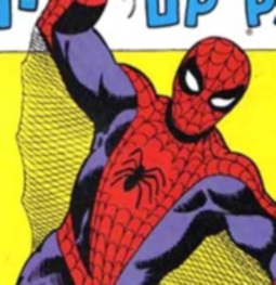
The Ditko Look

The above image is from an early issue of the comic. The Amazing Spider-Man #4, I think. Anyway, as drawn by Steve Ditko in these early days, the webbing pattern on Spidey’s costume was fairly dense, and typically his mask had more “spokes” and “rows” of webbing than in later iterations (though, again, there was no real consistency from panel to panel). There was also not a real consistency to the curve of the rows. I find the overall effect pretty pleasing, myself.

The Ditko eyes are kind of medium in terms of overall size, but usually with thick black around narrowed white. To me, this is the classic look of the eyes. I’m not a fan of the *huge* versions you’ll see later. But I’m getting ahead of myself.

The John Romita Sr Look

Okay, looking at this image and other Romita Sr Spidey images, I have to say that I have two strongly competing notions of “classic” Spidey in my head. I guess I think of Ditko Spidey as “primal classic” Spidey, but Romita Sr Spidey as “classic classic” Spidey. And I daresay that a lot of people of my generation–comic fans and otherwise–would look at this image and think of it as matching up to the concept of “Spider-Man” in their brain.

Anyway that aside, let’s look at the mask. We see that the web pattern has spread out, gotten less dense in terms of spokes and rows. The curves are less exaggerated, and more regular. The eyes aren’t that different from the Ditko eyes, really. Maybe a bit less curvy, and more symmetrical, each to itself, and to each other (was that bad grammaring?).

McFarlane Spider-Man

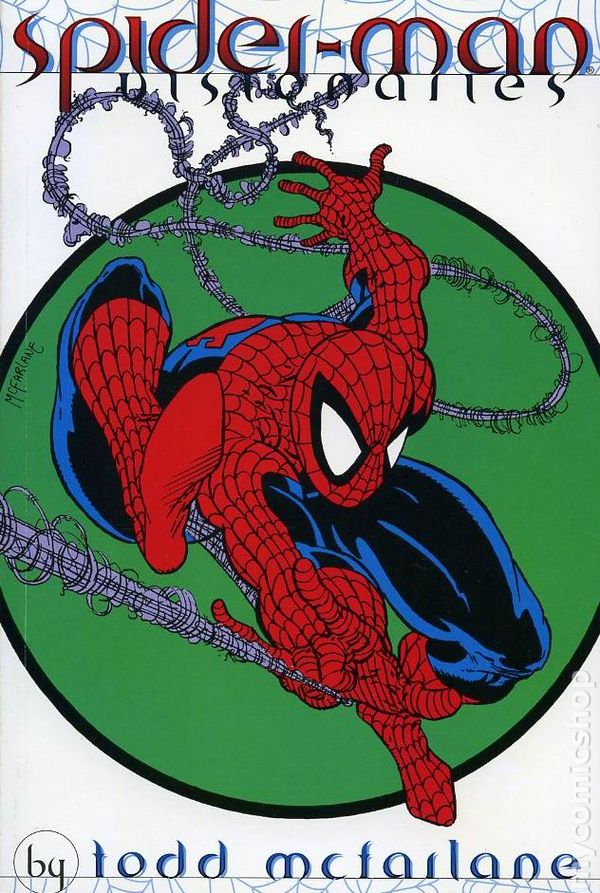
Now, don’t get me wrong. In high school/college, I was as much into the wacky Todd McFarlane and McFarlane-esque takes on the webhead as anyone. It was a crazy, off-kilter style, and actually stood out somewhat among the other overdone, overly detailed, overly cross-hatched, anatomically questionable art of most of the comics in the 90’s (though McFarlane’s art was those things as well).

The 90’s was a heady time for comics. Looking back on it, it’s like comic fans were in something like a drug-induced haze, except instead of drugs, we were high on multiple “alternate” covers of the same comic, including “holographic” versions, shiny silver versions, shiny gold versions, radioactive versions, versions made of meat… It was a collector’s market, and was–like the Internet bubble or the housing bubble–destined to collapse spectacularly. But that’s another story that I leave to bloggers who like to do more accurate research.

Anyway. Where was I. Oh yes. The Spidey mask of McFarlane and the 90’s in general.

Remember what I said earlier about the massive Spidey eyes to come? Well, just look at those eyes!

I’m actually conflicted about this style of the eyes. I kind of hate it, aesthetically. But if you think about it real life terms, it makes sense in terms of expanding the field of vision out of that mask. (‘Cause, you know, that’s what we need to be focusing on regarding a guy with the “proportionate strength, speed, and agility of a spider” as gained from a bite from a radioactive/genetically modified spider.)

Still, I prefer the smaller eyes.

Incidentally, the webbing pattern density has been cranked up again in this version. I can go either way with that, actually. I like both.

John Romita Jr Version

En Espanol!

First off, isn’t it cool that the son–John Romita Jr–was able to follow in the footsteps of the father–JR sr–by drawing Spider-Man for the comics?

In any case, I have a love-hate relationship with Romita jr’s Spider-Man. In general design terms, I really like it. But sometimes I feel like he makes his figures look so…I don’t know…solid. Dense. Heavy. This can result in Spidey looking too solid to be leaping around as lightly and agilely as he does. I’m being picky, I know.

Anyway, the mask’s webs and eyes are not that different from the McFarlane spidey, but the webbing is more regular, and somehow this version of the big eyes doesn’t bother me as much. It feels more restrained.

Raimi Movie Mask

I think they did a good job splitting the difference in terms of the webbing pattern density and the eye size. I don’t love the raised webbing, as I’ve said before, and am a little iffy about the angular eye shape. But overall, kudos.

Something to specifically point out regarding live action Spidey masks is how they handle the “he can see out but we can’t see in” aspect of the lenses. They did well here. I take it that it is hard to make one-way white lenses like this. Now, I don’t know how *well* Tobey and the stunt double can see out of those lenses, but they nailed the look pretty well.

Marc Webb Movie Masks

Amazing Spider-Man 1

The first ASM movie, they went with smaller eyes with darker lenses. The idea was something more homemade, and I think I read that the lenses were actually from sunglasses. I would’ve preferred lighter lenses, but I kind of like the eyes overall.

The webbing pattern was oddly grid-like. Not accurate, but then neither was the costume in general. Early on I decided to accept it and move on. I loved the movie by the way.  Superior to the Raimi films, in my opinion.

Amazing Spider-Man 2

Back to those big eyes. I can only assume most fans love them? I liked this costume, actually. Again, could’ve done without the raised webbing, but it didn’t distract from my enjoyment. This is–as many would agree–the most comic accurate movie costume to date. Whatever minor details are off, it overall captures the essence of Spidey’s look. And Garfield, in my opinion, has done the best job of capturing Spidey’s personality so far.

The eyes, as I said, are the big version. The shape is pretty spot on. The webbing is also pretty classic in terms of density and shape. I feel like they haven’t done super curvy webbing rows in the movie costumes.

Bonus: Nicholas Hammond Spidey

“I’m surprised! Constantly!”

Classic in a different way. I have a real affection for this version. As crudely made as the costume is, it is perfect in terms of the web pattern, and the eyes are so very close to my perfect Spidey eyes.

As to the crudity of the costume: isn’t that what we might expect from a costume made by a teenager/college student? I’d say he did pretty good, considering.

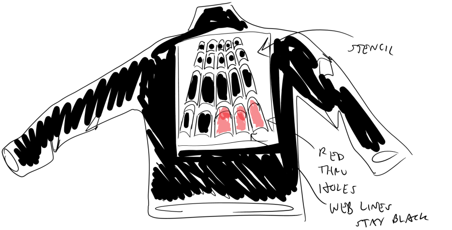
UP NEXT: Final patterning and hoping for time to sew


Let’s Talk Spider-Hands

So, while I’m gearing up for doing some actual full-sized sewing, I’ll take a little side-trip into the upcoming design side of the eventual costume(s).

Let’s cut to the chase: Spider-Man’s costume is a pain in the butt for an artist or designer. That web pattern! Not only is it time-consuming to draw in a comic (over and over), it is difficult to draw it consistently. In the comics, this didn’t matter a whole lot, right? As long as you stick the basic layout, who’s gonna notice? To an extent, that’s true, and maybe the casual observer wouldn’t notice minor changes.

But comic book fans are anything but casual observers.

Here’s how they did the webbing on the Raimi Spider-Man costume:

spideywebhand

It’s actually kind of a cool idea. The pattern is reminiscent of the web expanding outward as it fires from his wrist (the fact that he had “organic” web shooters in the Raimi movies is a whole other discussion, but we’re not going there right now).

So, cool, but not “canonical,” in terms of Spidey Religion.

Honestly, I didn’t mind this so much in terms of the movie experience. If anything about the costume bothered me, it was the raised, silver-colored webbing. And the sharp edged eye lenses were a bit off, I thought. And the back emblem, designed as a larger version of the chest emblem, was cool, but jarringly non-traditional.

Am I making the point about comic fans not being casual observers when it comes to these details?

Anyway, back to the palm webbing pattern… Here’s how they did it for Amazing Spider-Man 2:

It’s basically just an extension of the pattern from the arms. It’s totally fine. Honestly, I didn’t even notice it either of the two times I watched the movie in theaters (wait, now I’m countering my point about comic fans). Overall, this was the most satisfying movie costume yet, but I can’t help but make the usual obnoxious comparison: “Well, in the comics…”

Actually, I suppose this isn’t so different from, say, the Hunger Games or Harry Potter fan who says similar things: “Well, that’s not how it was in the book.” (Did you ever notice that the drawings of Snape in the books showed him with a goatee/mustache, where in the films he’s clean-shaven? Maybe the [seemingly] evil guy with goatee is too cliche?)

Now, I pointed out that it is hard for comic artists to draw the overall web pattern consistently, and there have been some crazy aberrations from artists here and there, but there is actually a general “canonical” set of parameters for the webbing, even the webbing on the hand. This guy does an excellent representative drawing:

It’s sort of like the web rings from the thumb, index finger, and pinky spill down onto the palm and spread out to meet, like ripples. Non-overlapping ripples. Or something.

Anyway, for the “traditional” version of my costume, this is the way I want to do the web pattern on the palms. There are other aspects I am willing to alter, but for some reason this one is a sticking point when going for a “traditional” look, along with the “proper” classic back emblem.

All right. That’s enough about Spider-Hands I suppose. I mean, it’s like I can just go on and on about minor details of super hero costumes or anything…

UP NEXT: MINOR DETAILS ABOUT SPIDER-MAN’S MASK


More Mini-Sewing Prototypes, Stressful Dance, & the Taj Mahal

Ugly Stripey Pants

So, a quiet start to our Saturday yesterday. I always start my days quietly, when all goes well, by getting up way too early and doing my thing before anyone else is awake. My daughter has been sleeping in until a decent hour for a while now, which is nice.

But even as the household stirred, we all took it pretty slow, sitting around, reading, jumping on the bed (just my daughter did that part), watching TV, etc.

And I put together a mini-version of the planned pants pattern.

wpid-img_20140531_080649924_hdr.jpg

wpid-img_20140531_105321.jpg

Again, the scaling does not translate perfectly, but these are actually high-waisted by design. The idea for this second version as compared to the first iteration incorporates two key changes: more room at the–er–junction of the legs and a higher rise at the waist. The reasons for the first are obvious, and the higher waist is so that the shirt–which will go over the waist of the leggings–will more easily connect to the leggings’ waist in whatever manner I end up choosing. The higher rise will also better accommodate bending over and squatting and such.

In this picture, you can just barely see the double seam on the front, and I hope it is not too obvious on the final product with the black spandex.

 Hip Hop

That was the morning sewing, and then it was time to get an early lunch before my daughter got changed for her Hip Hop dance competition. Her mom has been taking her to dance classes for a couple of years, and they have one or two competitions a year.

I had taken her to one of the competitions before, but am somewhat out of the loop as to the preparations and registration and such for the things. In this case, my ex just told me to show up at such and such high school with our daughter in her dance outfit, much like the last one I had taken her to. That first one had been pretty simple. We showed up to meet my ex, who fussed with our daughter’s hair a bit before sending her to wait with her dance group, and then we watched and clapped.

This competition seemed to be–well, organized chaos but without the organized part. It was actually a cheerleading competition, with some dance routines as a sort of “opening act.”

But once we navigated the chaos and figure out where to go (and once my ex figured out her GPS was taking her to the wrong school and got herself to the right place), and that I needed to go wait in a line to get her a yellow wrist-band thing to show she was registered, the dancing commenced.

It was terribly cute, of course. My daughter did very well. She’s got the moves (which she did not get from me). I will say she does much better as a solo dancer. Coordinating the movements of that many young ‘uns at once must be a crazy challenge for the instructor.

There were trophies for all, as usual. But this year my daughter–let’s call her “K” from here on–is old enough to notice that everyone getting a trophy isn’t the same as “winning.” But she doesn’t seem to mind. Like me, she is not the competitive type. Well–more accurately, we get stressed when we feel competitive, so avoid getting competitive.

The Taj Mahal

Later on, at K’s request, we all went out for Indian food at a place called the Taj Mahal. My girlfriend’s dad is from India, and though she wasn’t raised on as much Indian food as one might think, she’s no stranger to it, and I left the choice of dishes up to her and K. Butter Chicken, Chicken Tikka Masala, and Naan. Pistacho Kulfi for dessert. I’m not a real foodie myself, but this was a good meal.

Updated update of the updated shirt

Back at home, as we all wiled away the evening, I put together a mini-version of an updated update of the shirt pattern. (I forgot to add seam allowances, hence the pinpoint-thin sleeve ends, but this was proof-of-concept so not a huge deal.)

wpid-img_20140531_200649.jpg

The collar is smaller, more to my liking. But with the sleeve hems angling from armpit to collar as they are, I think I will need to add complementary curves to sleeve and torso/collar pieces where they meet to avoid excess wrinkling at the shoulders when raising my arms and such.

I am eager to put together the hopefully final full-size version of the semi-practice suit, but I really do want to be as sure as possible that my patterns will work!

Up Next: finalizing patterns, some laundry, cleaning, and our first visit to the pool for the summer

Nothing quite like the Classics…

So, I think I’ve finally got a shirt pattern that will work, so now I just have to have time to pull out the sewing machine and related mess and give the pattern a try. This weekend should be good for that, I hope. I might also try to make my daughter some shorts, since the summer heat is upon us. I dragged her to the fabric store with me not long ago, and she picked out some discount fabric to mess around with, so I’ll probably steal some of it to make her something.

Also, I’m making good progress on my latest Photoshop template costume design option, a “Classic” Spidey look in terms of the color and web pattern:

design_new_traditional

I’m also pretty happy with the traditional back emblem. The comics and movies have done some updated “cool” looks for it, making it more like the chest emblem, but I have a fondness for the old look. Even though it looks more like a bloated tick than a spider.

I’ll probably modify the chest symbol for this design as well. The current one might be a bit too modern. But I don’t want to go too classic. I mean, this is the first iteration from Ditko and the gang:

ypZR4


It definitely looks more like a spider than the original back symbol, but I really like the vertical mirroring of the more modern iterations that came a bit later:

It has the traditional look, but with more pleasing symmetry, and not overdone like some of the more modern takes.

All right, now let’s get this Friday started.

Spreadsheets Can be Fun! (or at least useful)

Re-Patterning the Tunic

I did some more sketching and planning for the way I want to pattern the new version of the Spidey “tunic” for version 2 of the practice suit, which included getting some fresh measurements. I took a lot of measurements. Possibly too many? But I figure it’s better to have some I might not use than wish I had some that I need. Or something like that.

Regardless, the notes I was taking as I jotted down the measurements quickly got out of hand, and I got weary of calculating and recalculating, and I finally got around to doing what he smart Internet people I have been learning from (this helpful lady and this helpful guy in particular) have done: I created a spreadsheet.

DISCLAIMER! I just finished the spreadsheet partially pictured below, and have not made anything based on it, plus this screenshot doesn’t even show the whole thing… What I’m saying is, it might suck. If you want something more tried and true for measuring the torso (etc.)  for spandex, Somewhat Stretchy’s page on measuring the arms and torso is the way to go.

armtorso_spsheet

“But why did you make your own spreadsheet if that Stretchy guy already has some good measurement and tables and stuffs? Heck, there must lots of well-tested shirt patterns out there on the Internets!”

Well, glad you asked. There are a few reasons: stubbornness; I learn by doing; I want to do this shirt a specific way with specific needs for seam placement, etc. But I definitely owe a lot of credit for the basic concepts for the torso measurements to the Somewhat Stretchy site, and credit to So Sew Easy for principles of pattern making and translating measurements to patterns and so forth.

You might be able to see in the pic that I have included a column that scales all the measurements down to 25%. This is so that I can do a small scale version of the shirt to see if the pattern will basicallywork without using a ton of fabric. And this will be good practice for making clothes for my daughter’s dolls.

Preliminary (Premature?) Research for Fabric Painting

I’m very excited to get a good, finished costume base patterned and sewn so that I can start the phase of laying down colors and patterns to truly make it a Spidey suit. So I thought I’d go ahead and look into fabric paints that will be good for this process.

I didn’t even think I could just paint on a bodysuit without doing silkscreening before I heard this skilled cosplayer mention it in a tutorial video.

Anyway, I dug around with Google a bit yesterday and found this helpful discussion about such paints. After looking at a few of the options mentioned, the most likely candidate for my needs seems to be the “Lumiere and Neopaque” line found at the Dharma Trading Company site.

Sounds fancy…

I need something that can cover black without too many coats and stretches well with the fabric. Plus, after looking at discussions of how some of the paints need “heat set” with ironing to be washable, I chose this one as it can be set with a blow dryer instead of a scary iron.

I want a dark red, so I figure I will choose a standard red, assuming that the black of the spandex will show through to some degree, thus creating a darker red.

As to the webbing pattern, it should be interesting. Since the suit is black, I figure I can make webbing stencils to paint through that will add the red areas and leave the webbing areas the black of the suit.

Crude Artists's Rendering

Crude Artists’s Rendering

The front center and top arms of the shirt will take up the most of the paint, I suppose.

I’ve considered trying to pattern this out where I could actually sew red and black spandex together to get the base color pattern and then add the webs, but that is a bit intimidating. And not as fun. We’ll see.

Up Next: Making a Mini-Suit (probably)