Long time no post, so here’s–well, something

It’s been a busy week. In addition to preparing for my upcoming trip to Japan (less than a week away!), I was in the midst of interviewing for and being offered the position of Digital Library Manager/VuFind System Administrator. So that should be interesting. There will mostly be preliminary stuff before I go to Japan, and then I actually officially assume the position (that didn’t sound right) while I’m gone.

Anyway…the point is, I haven’t done much sewing stuff. But I have mostly finished the design for the separate shirt for the traditional costume. I might do a few more tweaks, but it’s mostly ready.

Screenshot (127)

If budget allows, I’d like to try and order it before I leave for Japan so that it’s here soon after I get back. Once I sew this and the gloves together, I theoretically (fingers crossed) will have the sewing done for the traditional costume. But then, I’ve thought I was almost done before!

Happy Sunday everyone!

Really intended to work on the mask model head…

I intended to do more work on the mask model head and practical testing for the frames and eye holes, etc. But I got sucked into getting the eye shape for the next version of the costume just right. Still not sure if I’m there, but I think I’m getting close.

First, thanks to the fine suggestion from SaiTurtlesninjaNX, I started with the shape of the eyes from the 70’s era Japanese Spider-Man:

Supaidaman

A little tweaking:

supaidamanu_eye_mod3PNG

And then I thought maybe I want the eyes an itty bit taller, more…I dunno, bulbous? So I found an eye drawn by Stuart Immonen:

This was a bit too big, so I tweaked…

immonen_eye_mod2PNG

First of all, yes, they are different. Probably only in a way that matters to me. But I think I like the second one better. I’ll probably try paper versions of each on the actual costume when the time comes and see how they look.

As for the actual testing on the existing costume mask model, I did do a little tape test to see what the Ditko eye looks like:

wpid-img_20140812_071429.jpg

I think the shape and size came out pretty well (the sides of the model head need to be bulked up a bit to be closer to my head’s circumference I think). But I am still thinking the foam might be too messy around the edges.

On my next day off, I hope to spend some quality time with Spider-Bob here, doing some more final testing.

Happy Hump Day everyone.


Spider-Man’s Amazing Egg Head

Today, my daughter and I will be heading home from the out of town portion of our week off of work and summer day camp, and I think we’re ready to get back to our own stuff, our own routines, and our own beds. And I will be ready to get back to the nitty gritty of working on the costume.

For today, though, we have another Spider-item for discussion: Spider-Man’s oddly ovular head.

We have several convenient, though unintentional, illustrations of what I am talking about straight from the comics. Here’s one example:

Of course, this little classic technique that has been around since the early Ditko Spidey comics is merely a symbolic representation of Peter’s dual identity, employed for various reasons. But for my purposes, it serves well to show the magical transformation that the shape of Peter’s head undergoes when he dons his Spider-Man mask. The degree of “head smoothing” depends on the artist, but generally his ears disappear, his hair is fully flattened out, and his nose and mouth become less apparent, even in profile.

This was surely just an easy, stylized way to draw him, and the shape of his head in-mask has become a rather integral part of his iconic look. The modern Spidey movies have even put special effort into achieving that magical Spidey egg-head, using an under the mask “shell” similar to the one pictured below (there are a number of folks who make them for cosplay costumes).

But in practice–that is, in the world of the story– the movies, like the comics, represent the mask as being just a mask:

Pictured: no mask shell

But I don’t mind this bit of comic and movie magic. After all, in real life, pulling a tight head mask over one’s head can result in something like this:

redmask

Somehow, that just doesn’t look as cool.

Up Next: Home!!

Screen Printing “meh-ness” and Budget Delays

So, yesterday went by in a blur, in good and not-so-good ways, but overall a good day.

Non-Costume Stuff

We designed our shirts and exposed the designs on a screen:

wpid-img_20140628_095004676_hdr.jpg

I think whose is whose (is that grammar?) is pretty obvious. 🙂

I had actually intended to (A) make my Spider-face a negative of what’s shown above and (B) do solid fills for the letters and sun in my daughter’s design, as I always worry about the thin lines. And sure enough, that did come back to bite me later.

But first I had to rinse the exposed screens to clear out the exposed portions, and that meant leaving the screen to dry while we did other things.

We went to see Maleficent, which I enjoyed. I had heard such bad things about it, but I found it entertaining. As is often the case with movies, I could certainly see what there was to criticize, and what might have been done better, but I didn’t let that stop me from being entertained. I think too many people ruin movies for themselves by watching movies as if they are movie critics. Not that there aren’t movies that are so bad I can’t get past the “criticizeable” portions, but generally I try to allow myself to enjoy movies first, and critique them later.

After the movie, we were on our way to a late lunch when my daughter’s mom called, needing a ride to go and pick up her car. That put us a bit out of our way, distance and hunger-wise, but that just helped us enjoy our lunch all the more. We stopped at the store to get a few essentials and some T-shirts for screen printing, and it was pretty much early evening by the time we got home (or late afternoon, depending on how you look at it, I guess…).

My daughter went off to read while I got the shirts ready to print. I started with mine, and that turned into an “aargh” moment pretty quickly:

wpid-img_20140628_180800.jpg

Now, I don’t mind the “faded” look, but this was a bit too much.

Oh well. I actually ended up getting a two-pack of white T-shirts for a good price, and I can still use this as an undershirt. I figured I would try again on the other one after doing my daughter’s print.

Now, this is actually STAGE 1 of my daughter’s, as she wants two colors, and the second attempt at my print:

wpid-img_20140628_180822.jpg

Hers came out a bit light, but better than mine. Today, I’ll add the heart and the sun in red ink (to hers, not mine).

My second came out better in some ways, worse in others. I wonder if I brush on a light, faded bit of red over the webby parts? Either way… Did I mention I needed undershirts anyway?

Costume Stuff

Here’s a bit more of what the “finished” black-blue, comic-highlighted stuff on the Ditko costume:

Screenshot (54)

I go back and forth between loving and hating it. I feel like this quickly became a “slippery slope” situation in terms of the amount of muscleitude. I have another look to try, related but more understated. This…well, I like it better than all the “airbrush” type shading, but…I dunno…

Either way, I have time to keep working on and refining designs, and to decide which one–Ditko or traditional–to get printed first. I’m going to need to wait on sending either off for printing for “cash flow” reasons.

I seem to remember my mom often characterizing rocky family finance periods as “cash flow problems.” This usually happened at Christmas time, when she lost all sense of logic and proportion. Well, that hasn’t changed. Now she just spends the money on her grand-kids instead of her kids.

Up Next: Father-Daughter Screen Printing Part 2 and perhaps some Marvel Memorabilia 

Just about ready to go for it…

So, there comes a time when careful planning and preparation must give way to action. Whether it be in matters of love or war or–well–Spider-Man costume making.

I got some pointers about ink on dark fabric from an artist who has done some screen printing. I had wondered whether doing multiple coats was an option, and this artist verified that yes, there is a precedent for that. You just have to “register” the screen with the fabric, which basically means clamping the two together so that the coats get  laid down in the exact same place. That way you can lay down a coat of ink, let that dry a bit, and then lay down another one, etc.

I did some experimenting along these lines by laying another coat over the existing test prints on my test shirt. These coats are not lined up, as they are done at completely separate times without “registering,” but they illustrate how much difference a second coat makes:

wpid-wp-1403291336728.jpeg

You can compare the overlapped portions in the middle with the non-overlapped (underlapped? No,that doesn’t make sense…) around the sides. On the bottom, I had even played around with adding ink and doing another swipe immediately after the first, but that made a negligible difference and also seemed to create more unevenness of coverage.

Anyway, that’s encouraging. I think three–maybe four–coats will do it. I will add another layer to this test later on to see if three will do. I’d like to avoid getting a layer of ink so thick that it will restrict stretch and be prone to cracking.

I’m okay with the red having sort of a cool blackish and gritty look as long as it is clearly contrasted from the unprinted black fabric.

I also successfully completed attempt #3 for the wide webbing pattern that will end up as the base of the torso front and back. I was *very* happy with the job I did applying the emulsion this time, and think I will do even better on the upcoming screens.

wpid-img_20140620_143312.jpg

And, while I do feel like I’m on the verge of really starting to screen print the actual costume, there is one rather important aspect to figure out, and that is how to precisely line up the separate sections of printing on the costume*. This will matter most for printing the shirt, especially the connection between the chest emblem pattern and the way its web pattern “frame” interacts with the patterns below and above it.

But if I can figure that out tonight and tomorrow, then I would love to go and get some ink laid down on the costume shirt. And I suppose I just have to be ready to sew a new shirt if it comes down to it!  :/

*Update: Ha. Once I started mocking it up in Inkscape with shapes and layers and such, I realized it was actually simple. Well, in concept, at least.

The horizontal positioning was easy enough anyway; I just make guide lines on either side of the frame to make sure that the second print matches the first one horizontally.

For the vertical, though, all I have to do is carefully measure the height of the first print and position the first frame that amount below the first, and that will line up the top of the second print with the bottom of the first. That’s for lining up the torso base web pattern with the chest emblem pattern.

For the left and right shoulder web patterns, above the chest emblem, they will be offset horizontally by half the width of the chest emblem pattern. Still, simple concept.

I’m sure someone who’s good at math and such could have figured this out in his or her head, without the need to visualize it, but hey, I’m a picture kind of guy.

The Weekend: Head Cold, Flat Tire, Dad’s Day, etc.

“How was your weekend?”

The usual Monday question. Politely answered with something like “Good. How was yours?” Or if it’s someone you think actually cares, you might give a more specific and honest answer. “Eh. I’ve had better,” or “It was so awesome I can’t remember!” (I sometimes forget what I did over the weekend, but because it was so forgettable.)

Anyway, as I was going to sleep last night, I thought, “how was this weekend?”

My first instinct was “It was bad.” I’ve had a stupid head cold since Thursday/Friday, it was hot and humid, I had to change a flat tire, we spent the first half of Sunday cleaning the apartment…

But then I realized that it didn’t feel like it was a bad weekend, in spite of that list of facts.

I was home with my daughter on Friday, and we saw a great movie, and swam (because I was still minimizing my sinus issues at the time) and had fun. We had an adventurous meal out that night, witnessing the drunken revelry of a neighboring table, which is pretty funny in retrospect.

Saturday–other than the “quick” trip for lunch and a necessary grocery trip that started off with the aforementioned flat tire–we hung around the house, did this and that.

I told my daughter I just didn’t feel well enough to go to the pool or do much else, and she said she was fine with hanging around the house. She might have meant it, or she might have just been telling me that to make me feel better. Either way, I was very grateful.

Sunday, I was feeling a bit better–which is good, since we really needed to clean the apartment. And as much as I didn’t really want to clean, it always feels good to get it done. My daughter even made good efforts at cleaning her room. It still needs work, but considering that asking her to clean usually results in her near-collapse with a sudden case of “I don’t feel good,” I was quite pleased with her efforts.

After cleaning and lunch, we went to the mall for coffee/snacks and wandering, then to the library for a book for her to read, and then to the art store for a larger screen printing frame and some fabric paint. Home for a bit, then out to eat so I could be treated to my dad’s day meal.

Then back home for K to paint an old shirt with her new fabric paint. While she did that, my GF read, and I worked on radically reorganizing my office closet to serve as a space for drying and storing my screen printing frames (no small task)….

Anyway, my point is… It was a good weekend. It would be easy to list those bad aspects of it and say it was bad. But the little, mundane, run-of-the-mill stuff that comprised it…it all just added up to something very unexpectedly pleasing.

So, how was my weekend? Good, thank you. How was yours?

wpid-img_20140616_064314.jpg


The Steve Ditko Spider-Man

The best I remember, I received my first Spider-Man comic in my Easter Basket when I was around 8 years old. It was a reprint of “The Amazing Spider-Man” #4 (“Marvel Tales Starring Spider-Man” #141 according to the Internets). I went on to read (and re-read) these “reruns” of the original Spider-Man series for years, and of course got a hold of any other Spider-Man comics I could. There were other back issues and current issues to read, including several different monthly titles such as “Peter Parker: the Spectacular Spider-Man,” “The Web of Spider-Man,” and so on.

But I feel very lucky that it all started with these reprints of the originals. I mean, for one thing, I was still a few years away from being born when the originals were being produced and released. For another, I’m pretty sure my mom–out shopping for Easter basket goodies for me and my siblings–just stopped by the comics with the idea of getting “a comic book for Ben.”

She likely knew that Spidey was a good choice. I was probably already watching Spidey on the Electric Company. (I told my mom I wanted a Spider-Man costume like the one on the Electric Company. She said I should write them a letter asking for one. I think I actually did. But I assume the answer was no, as I never received said costume.) I might have already been watching the Spider-Man and His Amazing Friends cartoon on Saturdays. But did she know that she was introducing me to the original stories from the 60’s?

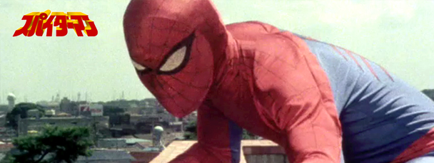
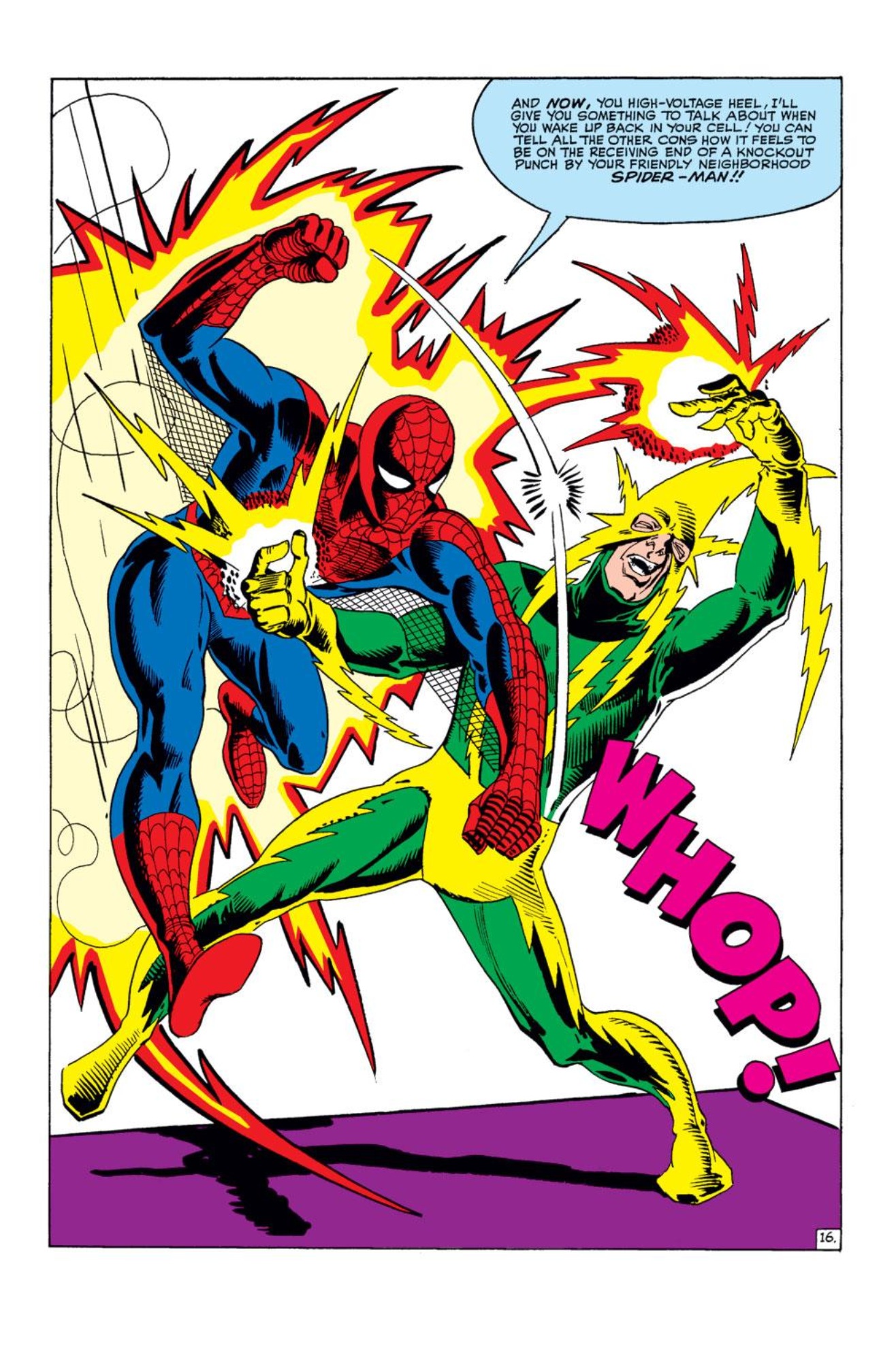
I don’t know. But I’m glad this was where I started. Because these were the comics by artist and co-creator Steve Ditko, and as I might have said before, Ditko’s Spider-Man is sort of the Primal Original Spider-Man to me. The images from his run on Spider-Man are very much embedded in my mind:

“Ahh, my leg! Is it supposed to do that?”

Look at that! I mean, look at it! That’s not just Spider-Man, as in a guy who wears a spider-themed suit and goes by the name Spider-Man. That is a spider-man, a spider-like person. Humanoid, but evoking–no, oozing spider-ness in the lean and oddly flexible turn of his limbs, the splay of his fingers…

There is just such a “Ditko-ness” that I cannot really describe. You can see more Ditko Spidey in a couple of image galleries such as this one and this one at the Chasing Amazing blog. (And I highly recommend you Google Steve Ditko and just check him out as an artist and a person in general. Very interesting fella, and truly foundational in more comics and comic characters than you might imagine.)

There have been many updates and reboots and new takes and so on regarding Spidey’s look. I’ve liked most of them, not liked more than a few. I would even say that there are many “cooler” takes on Spidey than Ditko’s. Still, the Ditko Spider-Man was my *first* Spider-Man, and that look is firmly rooted in my mind.

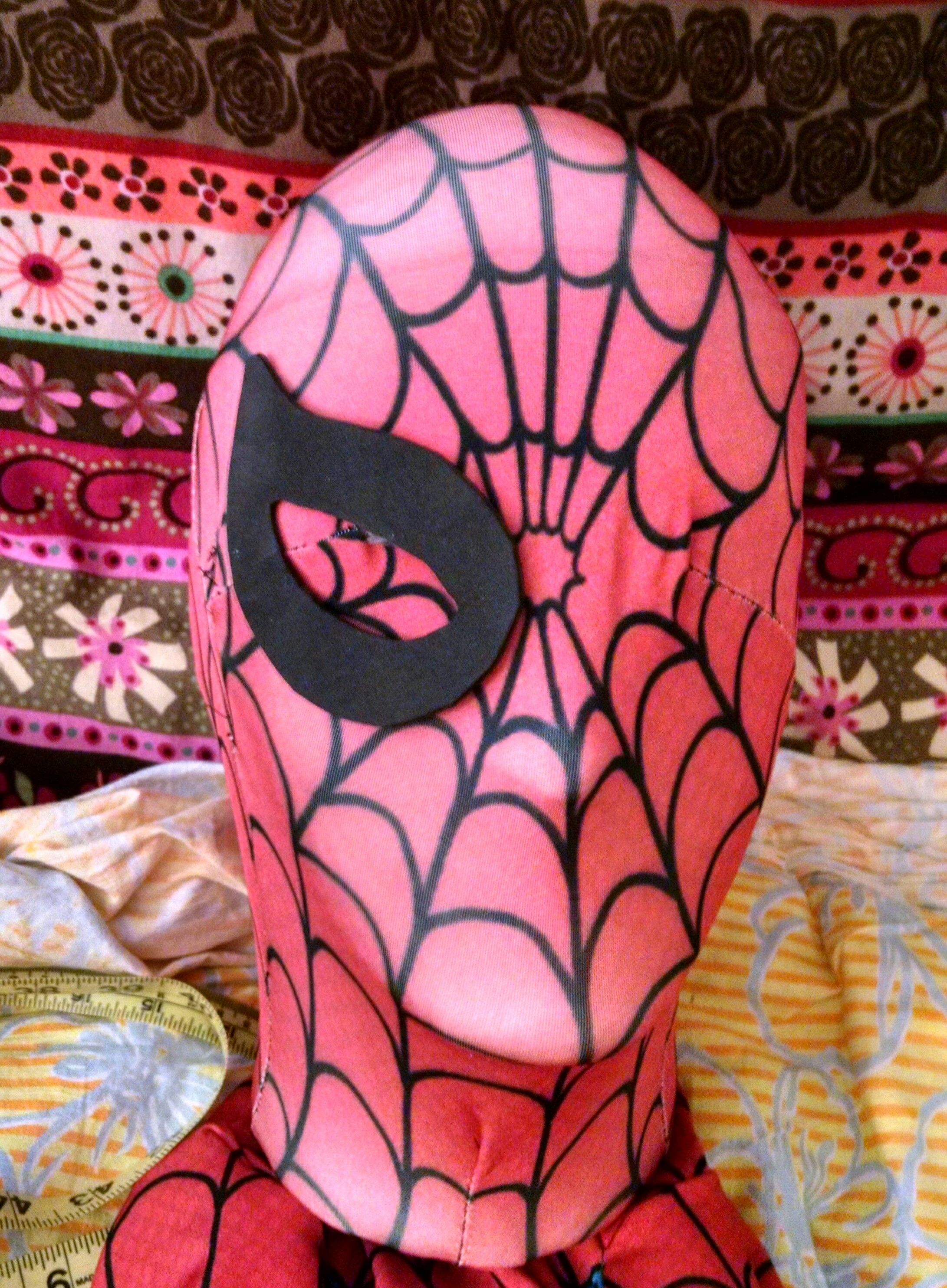
The Test Costume (that has possibly gotten a little out of hand considering the original intent)

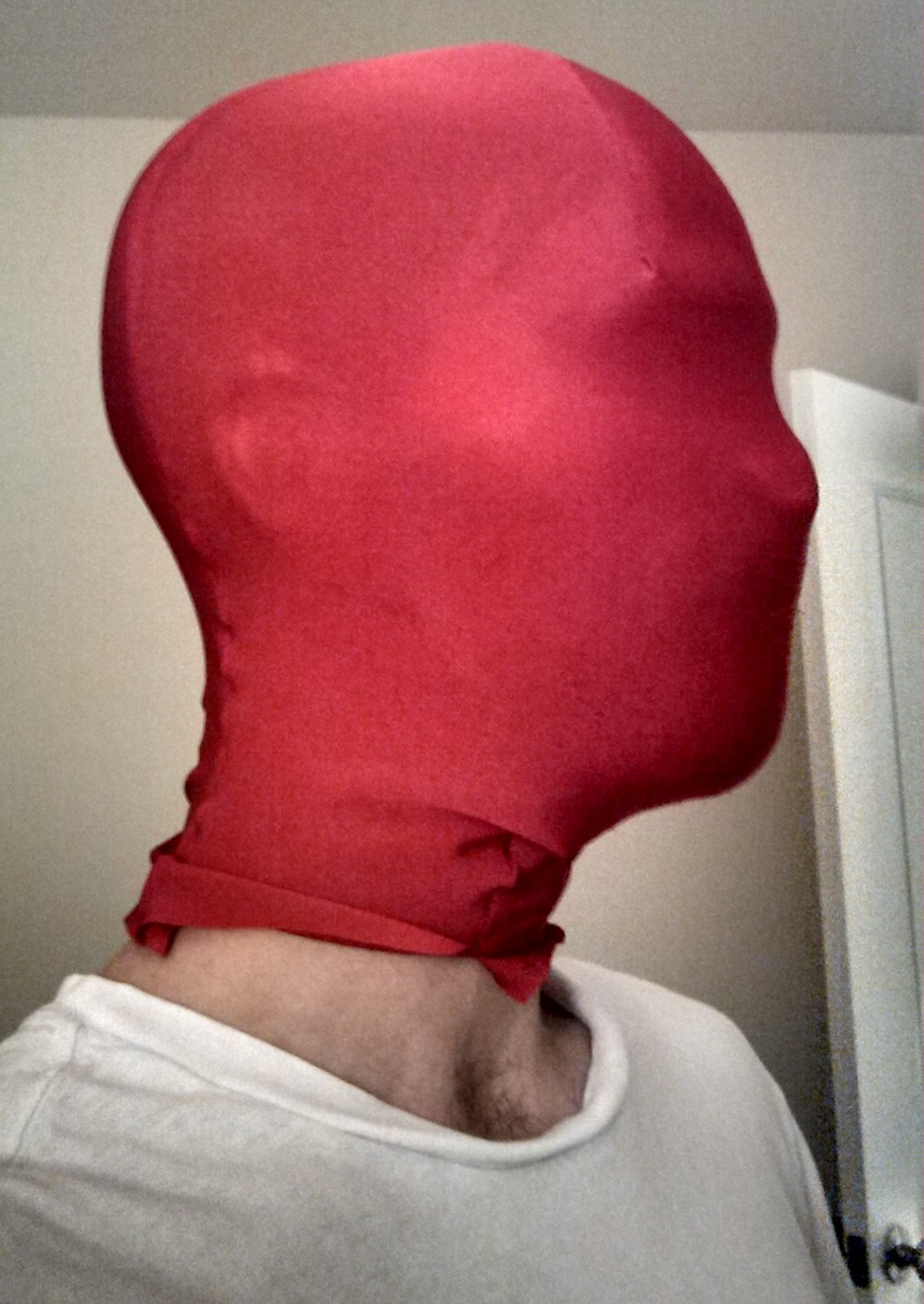
I started out this test costume with a couple of aims in mind. I wanted it to be much like the original costume Peter made in terms of components: mask, gloves, boots, shirt, leggings. I also set out to sort of explore just how hard it would be to basically hand-craft a costume the way he was depicted as doing. Not in the same way that Civil War reenactment types set out to create their uniforms using only the materials and tools available to them in the Civil War era. I was just kind of looking at it in the spirit of things.

I suppose I have stuck to the spirit of the idea in a lot of ways. I started with the basic material–spandex–and sewed it together in the form of the specified pieces. And I will be screen printing the design on that material, adding lenses and soles. But I definitely wonder how much more difficult this would have been in the pre-Internet age…

Anyway, I will save a full evaluation of the process for when it’s actually done. My point now is that considering the inspiration for the method of crafting the test costume came largely from those early Ditko comics, it only seems fitting to base the final design of the test costume on the Ditko version of Spider-Man.

The Design and Beginnings of a Plan

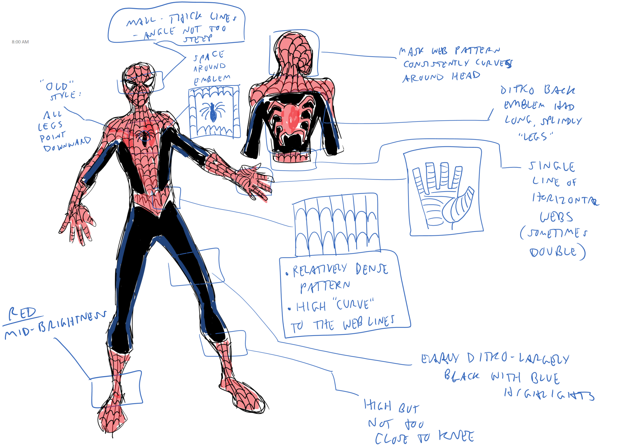
Since I have spent way too much time thinking about this, I have decided that there are 6 basic components to a particular Spider-Man costume “style:”

1) Web pattern: style and layout
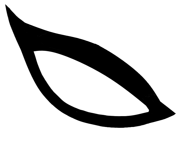
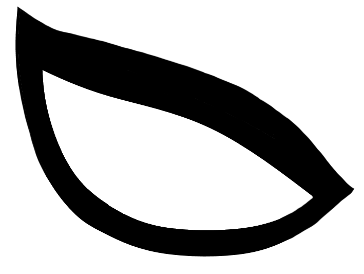
2) Eyes: shape and style
3) Chest emblem: style and size
4) Back emblem: style and size
5) Color: how bright the red and blue are
6) Balance and lines of the red and blue/black areas of the costume

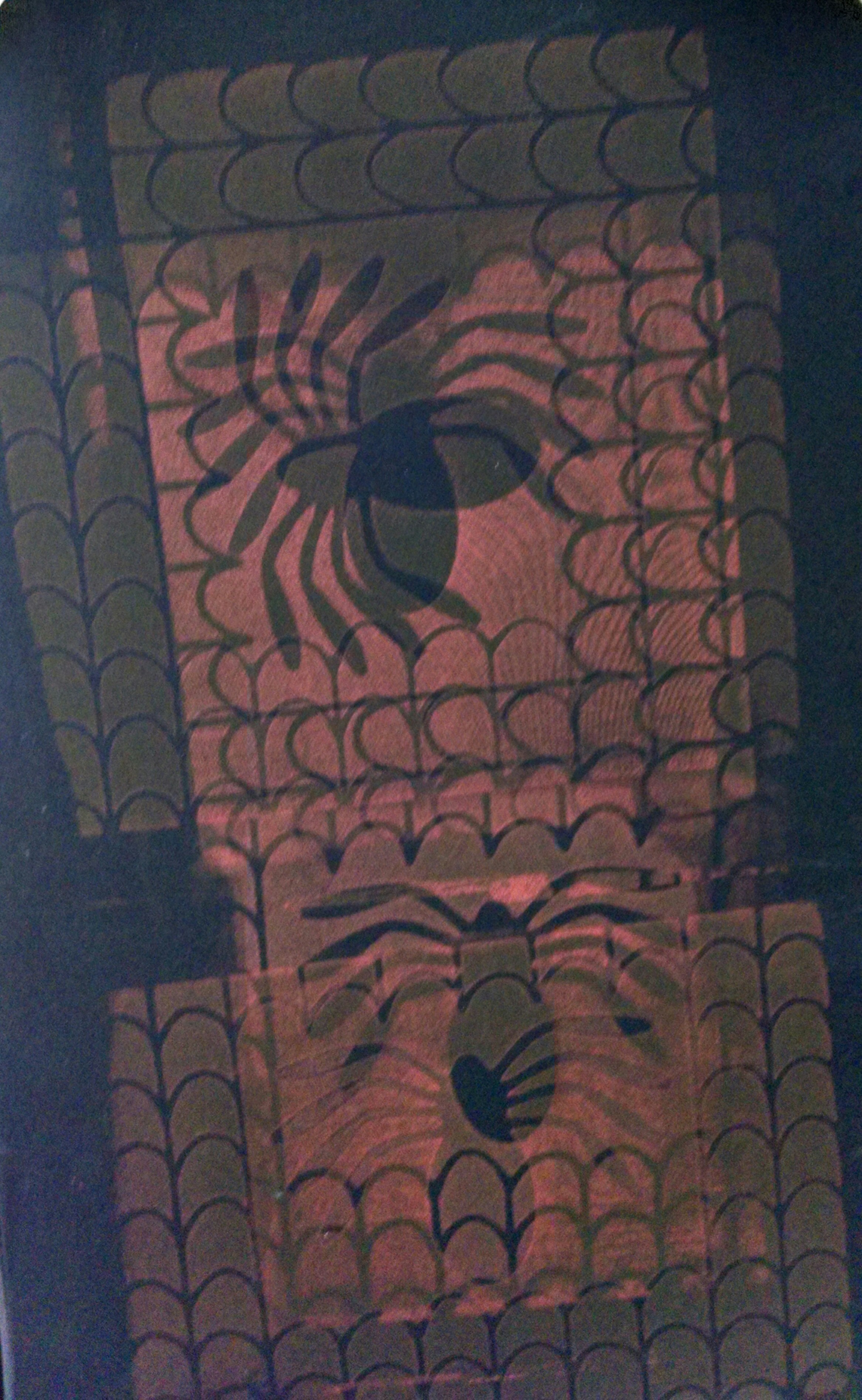
And to sketch out the Ditko aspects of that list in basic form:

ditkoplanPNG


So, fine for a general concept, but now I need to break that down into a specific, final pattern, and divide it into 8.5 x 11 “puzzle” pieces that I can screen print individually in such a way that they all fit together. And I need to do it using no more than 7 of those pieces, to save spending even more on supplies. Should be interesting…

Up Next: More Plan Details AND “Are we going to talk about that underarm webbing?”